HubLMS - How to Use the CTA or Button Module
Use the HubLMS Button module to help your learners take actions.
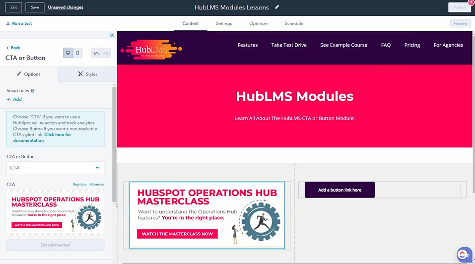
HubLMS gives you the option to add a button, or call-to-action (CTA), to your pages. First t note, the example below has two buttons lined up on the screen. You can include more if needed, using buttons where you need them.
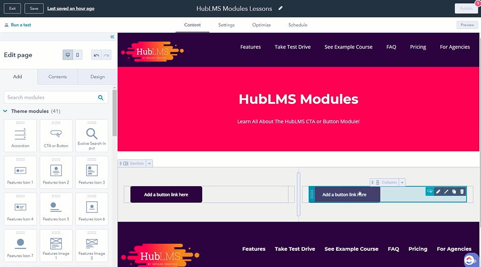
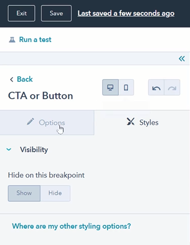
Next, when you dive into the actual module features, you'll see you have access to styling options.
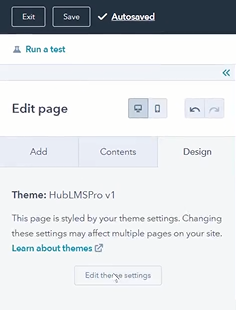
You can also change styles by going to design in your content tab, then to the theme settings. Once in the theme settings, you will find the advanced settings area.
In advanced settings, there is a "Buttons and CTA Settings" area where you can choose the background color of your buttons and the text color.
Once you've added a button or CTA to your page, you can edit the element.
One popular feature is adding smart rules.
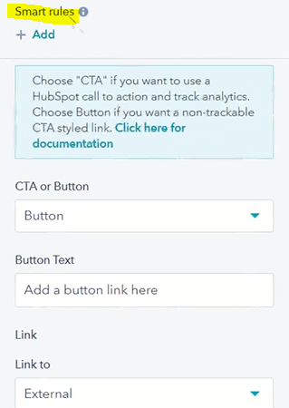
You can base smart rules on criteria like lifecycle stage so a Customer would see a different button than a Subscriber.
Next in the button module, you can choose to have a simple, single-use button or a CTA from your HubSpot CTA tool.
When choosing button, you'll see that you can easily edit and customize the button text. Then you can link to an external URL, a page out of your HubSpot content, a file download (which connects to your files in the file manager of HubSpot), an email address or a HubSpot blog.
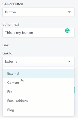
Once chosen, you can make one-off design changes for this button by using the style options in your editor to choose one of your settings from your primary color, secondary color, or tertiary color.
In addition to color choices, this is where you can choose the button's alignment in its module: left, center, or right.
In addition to the simple button, you can insert a HubSpot CTA into this button module.
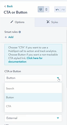
Go to the drop down "CTA or Button" and choose CTA. From there, you can pick one of your HubSpot CTAs and it will populate the module.
Now you know how to use the Button Module in your HubLMS theme.
