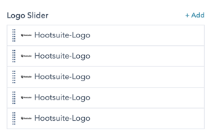
Module Example:
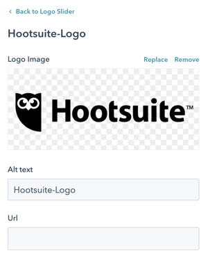
Module Fields:
Click the +Add button to add new Logos to your slider or hover over the existing logos to be able to edit them. Once you click to edit or add a logo you will see the fields shown below.
Logo Image
Choose the logo you want to use from your HubSpot File Manager or upload a new image.
Alt Text
Enter the text that search engines and screen readers can use for the image.
URL
Enter a URL if you'd like users to be able to click the logo in the slider to be taken to another page.
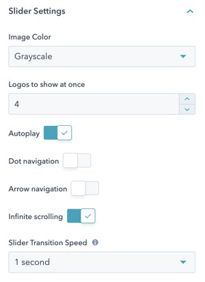
Style Options
 Image Color
Choose whether you want all of the logos to be full color (displayed the way you uploaded them) or grayscale (automatically remove color).
Logos to show at once
Choose to display between 1 and 6 logos at a time.
Autoplay (On by default)
Turn this toggle off if you do not want the slider to autoplay and instead require the user to manually advance the slides.
Dot Navigation (Off by default)
Turn this toggle on if you want to display dots below your slider that a user can use to navigate between logos.
Arrow Navigation (Off by default)
Turn this on to display arrows on the left and right side of the slider. User can then use these to advance the slides to see all the logos.
Infinite Scrolling (On by default)
Turn this off if you do not want your logos to loop. If turned off, when the end of the slider is reached it will restart at the beginning.
Slider Transition Speed (1 second by default)
Choose how long of a delay you want in the slide transition. You can choose between .5 second and 5 seconds in .5 second increments.
Recommended Module Usage:
- Ideal: Span 12
- Minimum: Span 4
- Maximum: Span 12