
If you’ve spent any time experimenting with inbound or digital marketing, chances are you’ve come across a landing page or two. Even if you are not familiar with inbound marketing, there is a high probability that, as a consumer, you have encountered a landing page.
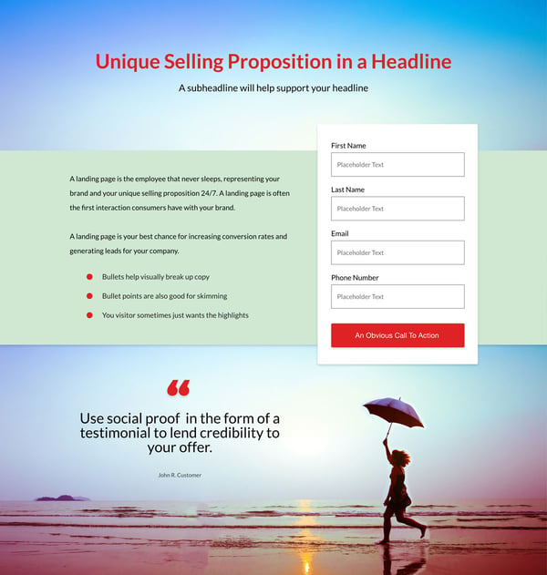
A landing page is the employee that never sleeps, representing your brand and your unique selling proposition 24/7. A landing page is often the first interaction consumers have with your brand. They may have arrived via paid social media advertising or pay per click marketing via Google Adwords or other similar service. In either case, a landing page is your best chance for increasing conversion rates and generating leads for your company.
Essential Landing Page Elements
While landing pages may differ in length and design, there are many tried and true elements they must include in order to be successful. The trick with landing page design is to make sure you’re only using the page to “sell” one offer or call to action. The best landing pages are focused.
To ensure your landing pages are ready to convert, make sure they include the following:
Unique Selling Proposition (USP)
How do you set yourself apart from the competition? What makes your product unique? The success of any inbound marketing campaign hinges on your ability to define what makes your company different. That reason is your Unique Selling Proposition or USP.
At Impulse Creative, we like to start with why, then build the story from there. However you choose to differentiate yourself, on a landing page, it has to be done as quickly and simply as possible. If executed correctly, your USP will leave little room for confusion. Set clear expectations that define why your customers should care about your product or service.
On a landing page, the USP is typically delivered via the main headline and subheadline.
Using visual hierarchy, you can ensure that users see the parts of your USP in the order you want. For example, main headline font size is usually a few points larger than subheadlines, with body copy being the smallest text on the page. (These rules actually apply to any type of typographic design. You’re welcome!)
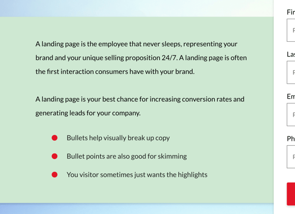
In addition to your headline USP, you’ll want to provide a bit more depth. The body copy is a good place to do this. But a block of text may actually hurt conversion rates if it looks like too much work to the reader. Breaking text up with an intermediary headline or reinforcement statement is both a good visual design element and a way to allow users the ability to scan your USP.
In some cases, depending on page length and how far a user has scrolled, your USP should also include a closing argument. This is your final chance to convince the jury and convert those leads. Using a headline-sized font for this final persuasive point will help it to stand out visually.
Large Graphic or Video
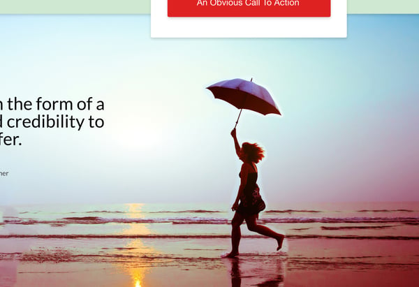
Sure the USP is perhaps the most important element of any landing page, but what about the visual cues? Many landing page designs execute this very well, while some neglect it entirely.
Imagery on your landing page is optional, but it should always be intentional and support your offer. These visual elements are another opportunity to give users context, a powerful tool in helping you to convert more leads.
If, for example, you’re offering a free downloadable ebook, a picture of the cover would be a great addition to the landing page. When setting up a landing page, I typically like to place the image closer to the top, near the body copy or the headline.
Other good options for landing page graphics include:
- Hero Image: Usually a full width image that sits above the fold, but behind the form headlines. This can be a striking way to set the mood quickly for your visitor.
- Hero Video: If a picture is worth a 1000 words, a video has to be worth more right? Video is engaging. So much so that by 2019 80% of web traffic will be to video content.
- Illustration: If your brand marketing or website uses them, try adding illustrations to landing pages to reinforce your message.
- Color: Similar to illustration, colors that represent your brand are a good way to attract the user’s eye. Maybe make your headline a different color than the rest of the text. Or even make the form container a color that provides contrast from the rest of the page. However you choose to customize your landing pages, color can be powerful. Use it.
Social Proof

Have you ever asked a friend what credit card or car insurance company they use? Word of mouth marketing, providing a product or service with social proof, is perhaps the most powerful of all the marketings. According to Nielsen, 92% of people trust recommendations from peers, and 70% of people trust recommendations from people they don’t even know. Those numbers are staggering. It’s safe to say you can’t afford not to include some form of social proof or testimonial on your landing page.
Gathering testimonials can be a challenge, but it’s one you’ll want to undertake on behalf of your product or service. Follow up with recent customers, via a drip email campaign or other similar tactic, to get some fresh perspectives on how well liked your offer is. The trick is to ask the right questions.
Content Marketing Institute has some great tips for doing just this including:
- How much money did our product save you?
- How much time does our product save you each day/week/month?
- What’s the biggest benefit you’ve seen as a result of using our product?
Collecting answers to these types of questions will garner you plenty of “sound bites” you can use on your landing pages. The best part about these testimonials is that you’ve personally went out and collected them, so you have full control over the medium in which they’re presented and where they’re used. On a landing page this is even more important, because your goal is to make the most significant impact in the shortest amount time.
The Call To Action (Plus a Form)
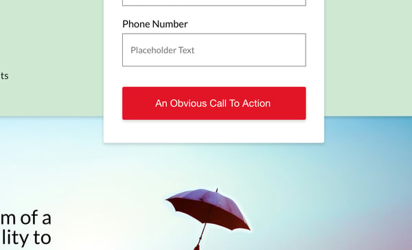
Web design first and foremost is about providing a fluid and uninterrupted experience for your users. This goes for landing pages as well. Instead of hiding important information behind too many clicks, give your visitors what they came for right when they arrive. It will not only benefit them, it will benefit you in the form of low bounce rates and increased conversions.
For this reason, a call to action or CTA, usually in the form of a clickable element like a button, is essential to the success of your marketing campaign. Because landing pages are designed with the very specific purpose of generating leads, your CTA should to be super obvious. Don’t make people think.
Many experts will say that your CTA, which presumably leads to a form, is enough. I suggest taking it a step further, for the sake of usability, by providing an uninhibited user experience.
Put a form on it.
If your landing page doesn’t have a form, either front and center or at least near the beginning of the experience, you may yet again be hurting your conversion rates.
Chances are, your user doesn’t have a lot of time. Be respectful of that. And remember, your form length should reflect the perceived value of your offer. That’s referred to as social currency and it should always be an equal exchange.
If your offer is simple one-page PDF, then email is all you should require from your user. Whereas, if you’re giving away a 15 page white paper to a middle of the funnel prospect, you can ask for a few more personal or contact details. Hubspot has some further reading on landing page form length. I suggest you check it out.
Using What You’ve Learned About Landing Pages
You’ve made it through the hard part. I’ve outlined some landing page essentials that will help cut down on bounce rates and increase conversions. Using these tips you can be sure your landing page is ready to rock, and your marketing campaign is working even when you’re not at work.
Now of course if you need help with landing page design, you might want to enlist and agency. And if you’re reading this blog, you just happen to be on the website of an agency who can help. To get started using landing pages for your next marketing campaign, learn more about our landing page design service.

.png?width=600&name=Webinar%20Thumbnail%20(3).png)
