
Landing pages come in all shapes, sizes and purposes.
Long form landing pages are great for laying out the details of your unique selling proposition (USP). With increased screen real estate, you can include things like video and social proof. That’s not to say you can’t do the same with shorter form landing pages. In fact, in many cases a shorter landing page, more content placed above the fold is all you need to increase conversions.
As the web designer at Impulse Creative, I design a lot of landing pages. Of the two styles - long and short - the visual designer in me prefers the longer form, but the reasoning is completely self serving. I get to design more with a longer page. Fun transitions, more buttons, different content modules. Stuff like that. However, the user experience designer in me understands that shorter landing pages are better for the visitor, thus ultimately better for improving conversion rates. (Marketers and sales professionals love me!)
Many of the examples below were picked for their simplicity and clear adherence to the list of landing page essentials I wrote about in a separate blog post. Each is a bit different than the next. Peruse the examples below and let us know in the comments which one you like best.
HubSpot
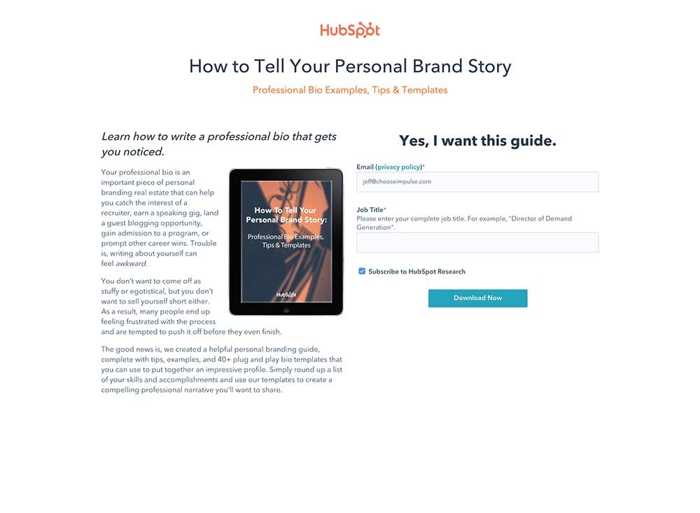 Perhaps the simplest design on this list (and from the king of Inbound no less) is this landing page that follows the landing page essentials list to a tee. The USP is front, center and executed succinctly in a headline and subheadline. Supporting text flanks a nice image of what you get once you fork over your information. Finally, the form is visually clear and matches the perceived value of the offer.
Uber Eats
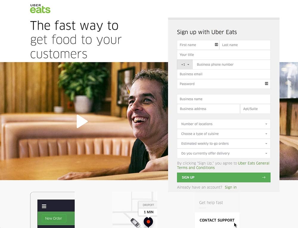
I love the Uber Eats landing page because it’s uncomplicated. It makes excellent use of the brand color on key areas of the page, including on the call to action button. Also included is a video which doubles as social proof in support of Uber Eats’ unique selling point: “The fast way to get food to your customers.” Bonus points for not playing the video automatically. Users hate that.
Splash
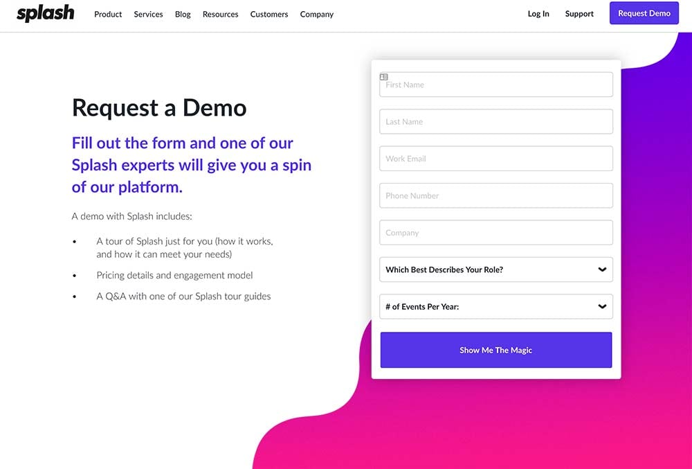
This landing page from Splash is simple and bright. The bold pink and purple gradient element brings the user’s eye directly to the form and call to action. The only thing they’re possibly doing wrong here is not removing the navigation. In many cases, having navigation links present on a landing page actually hurts conversion rates because they distract your user and offer a way for users to bounce out.
Shopify Plus
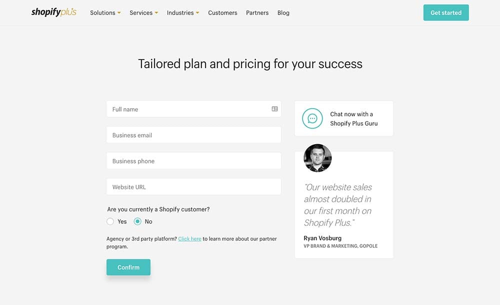
This simple design comes from Shopify. The form is short and is designed to get the most basic qualifying information from the user. I also like the way social proof is handled here. It’s short, to the point and includes a photo of the subject. This small design element provides a lot of authority that a skeptical potential lead may need to help them buy in. One last interesting feature of note is the ability for users to “chat” with a customer service representative. I haven’t seen this very much. I’d be interested to know if it converts more than the form.
Mixpanel
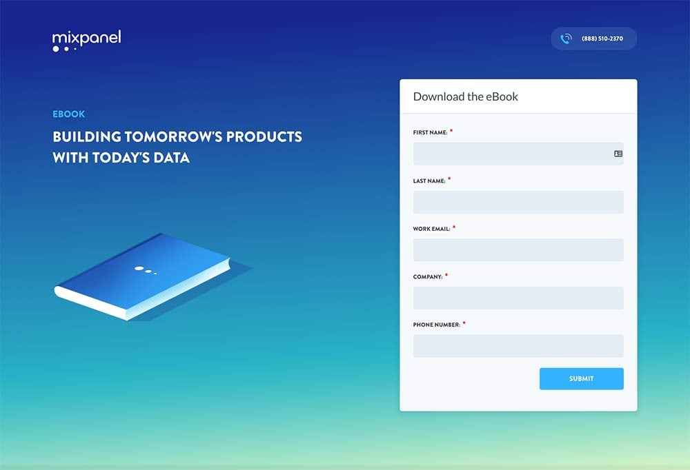
Like the Splash example above, this is bold and bright. The color envelopes the user’s screen and instantly puts them in a calming mood. I wonder if conversion rates increase when users are relaxed? For an ebook, the form length is spot on. I think the USP is a little light however, and the text is nonexistent beyond the headline.
Harry’s
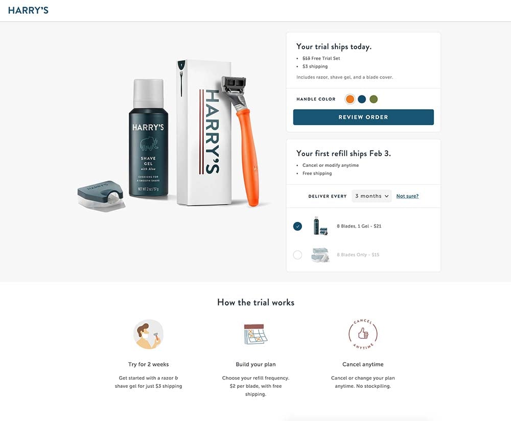
This landing page from Harry’s shave club is the only ecommerce example on the list, but it follows many of the best practices for landing page design. The page features a large image, simple form, reinforcement statement and removes navigation from the page. I like the use of icons, too, as they add a little depth to the USP and are on brand for Harry’s.
Souq Avenues
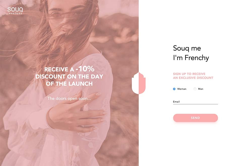
This landing page basically comprises the entire Souq Avenues website, as the full site hasn’t launched just yet. In the meantime, visitors are offered an “exclusive discount” in exchange for their email. Seems like a fair deal. The design is elegant and the understated color palette keeps the page focused. You’re supposed to do one thing here, and that’s all you can do.
Involvio
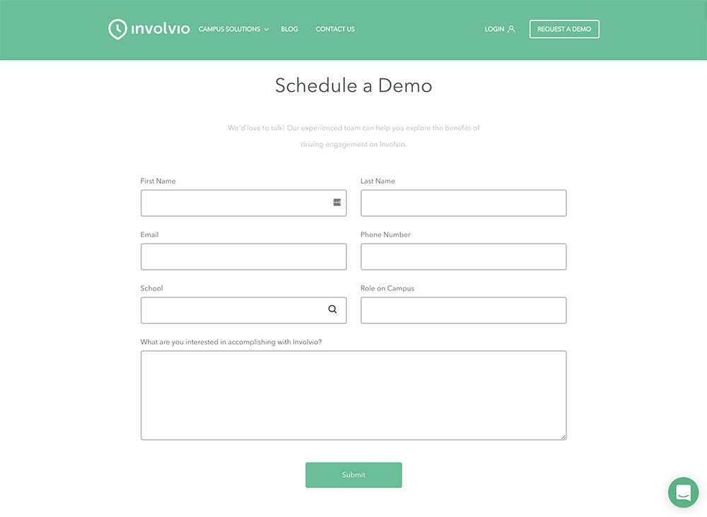
Involvio offers a mobile solution for increasing campus engagement for colleges and universities. Thus their landing page is about scheduling a demo to try their technology. The form is front and center without much to distract the user from converting.
Instacart
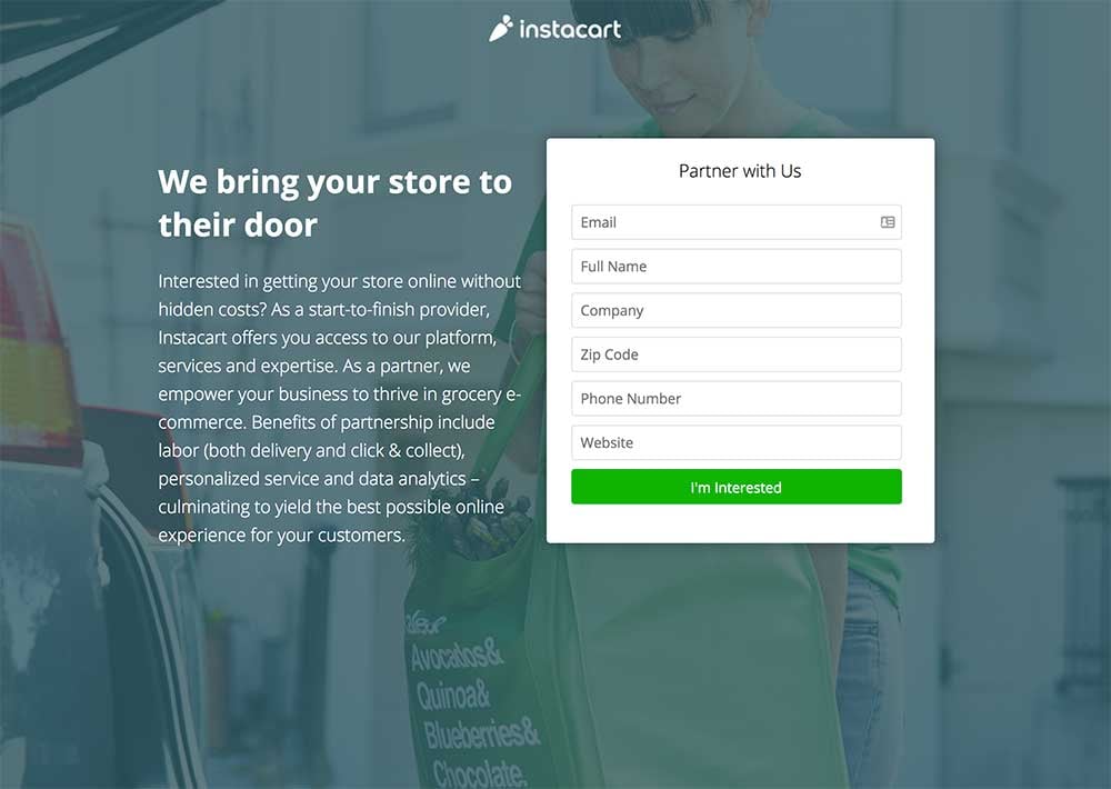
The Instacart landing page is super focused. The USP is to the point, with just enough supporting text to not overwhelm the visitor. The form length is visually the same as the text, which helps the experience remain uninterrupted and easy to use. The green CTA sticks out in a good way and immediately attracts the eye.
WaiveCar
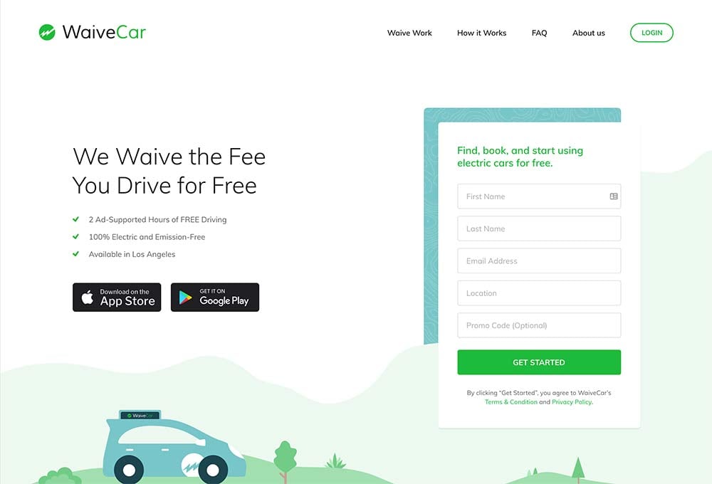
The WaiveCar landing page is probably my favorite of all the examples on this list. The design is clear and fun, makes good use of the brand colors, and features a nice illustration to support the USP. However, it does make a couple of mistakes. Namely via the use of navigation and links to download the mobile application. Anything other than a CTA is distracting.
SEO PowerSuite
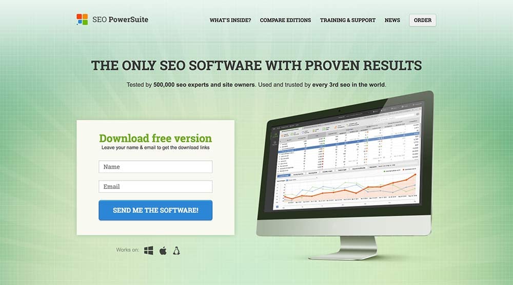
This isn’t a traditional landing page, but the SEO PowerSuite homepage is using some of the essential tactics you would expect from one. The form is focused and supported by a large graphic of what the user receives after giving up their information. The contrast between the large headline and subheadline is powerful, too!
Impulse Creative
You didn’t think I would forget to toot our own horn here, did you? The landing page design we use most often basically follows what you see above. No navigation, a large headline, supporting text, a relevant graphic and a form. We’ve actually found that conversion rates are highest with this design. In some cases hovering around 60%. If you don’t believe me, find out what we can do.

.png?width=600&name=Webinar%20Thumbnail%20(3).png)
