People do business with people they get to know, like and trust.
People.
Some brands like Virgin say people are their greatest asset.
People.
So… why don’t you design a kickass team page to highlight your people, their personalities and your brand?
Brand loyalty begins with your people. If you’re ready to leverage your best asset and design a great team page, we have some inspiration for you.
Here are 23 team pages that inspire us to showcase our amazing talent, better.
Wistia
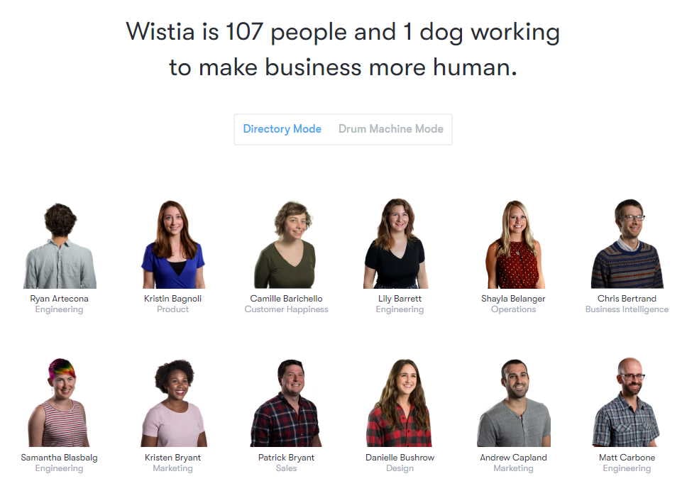
It’s no surprise that the creative team at Wistia, a video hosting and production company, built something amazing. The interesting thing is that Wistia is in what might feel like a boring B2B space, and yet they own their brand voice. Keep that in mind B2B marketers.
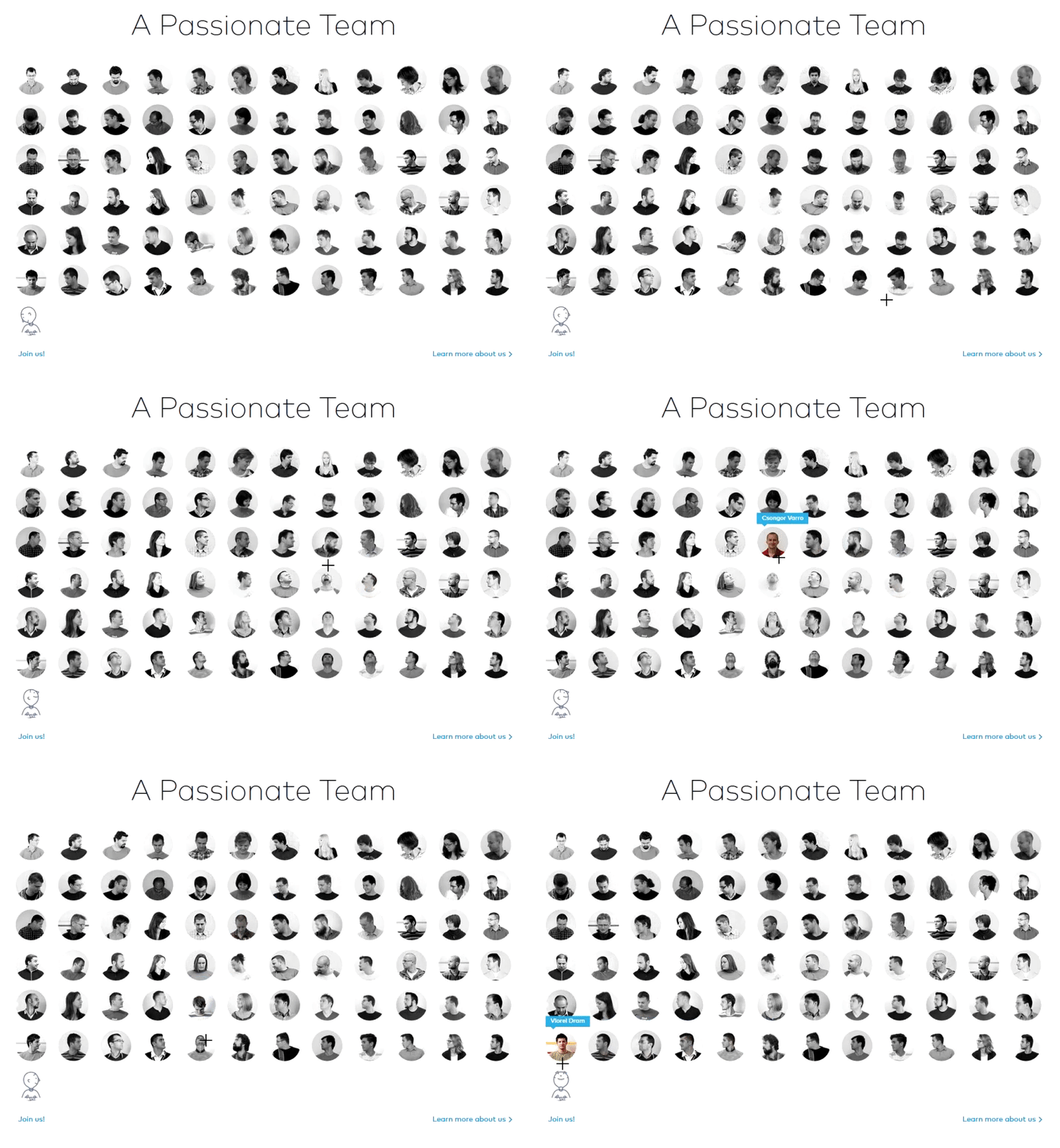
Wistia attacks the standard team page with a super-modern take on a traditional yearbook feel. When you hover over each photo, you get a feel for their personality. Even just the first person, Ryan, blows your mind with the pivot and disappearing act. Very cool.
But that’s not all!

Switch from “Directory Mode” to “Drum Machine Mode” and see how long you stay on this page!
Atlassian
You might expect an enterprise software company that develops products for developers, project managers and content management to have a kickass team page. And if you’re looking at the Atlassian about the team page, you’d be right.
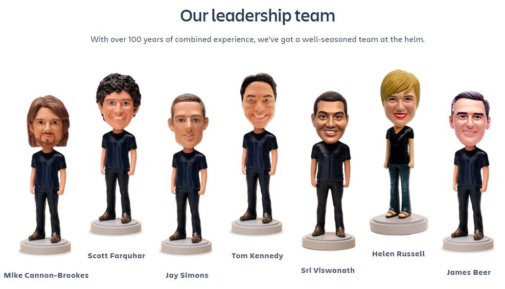
The first thing you notice is the team photos that showcase their personalities (including indoor rock climbing!). Then comes the amazing bobbleheads! And they actual bobble! 🤯
Further down, Atlassian offers a press kit with more, and a great call to action to become part of the team. “One of us! One of us!”
Love it!
6tematik
The French digital agency 6tematik shows off its chops with a great team page, highlighting their work, references and team.
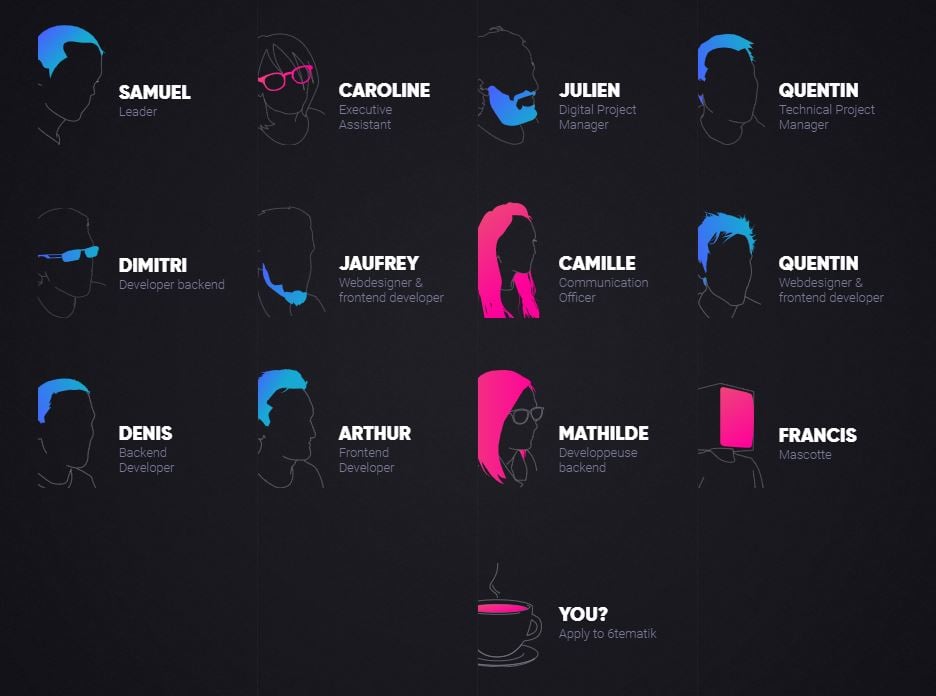
The team section is hip with its neon-feeling silhouettes that move. Then at the bottom of the team is a coffee cup with “YOU?” as a call to action to join the team.
Rock Kitchen Harris
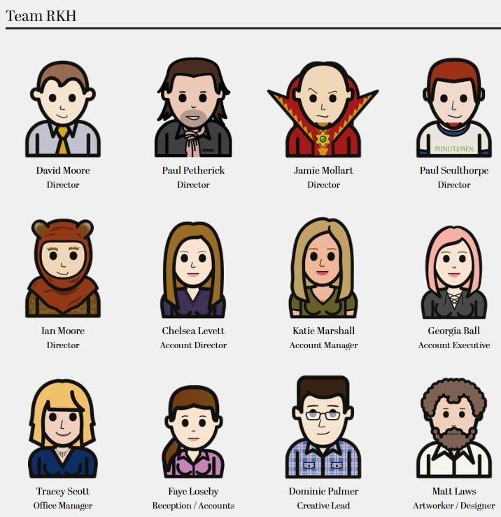
Have you ever wanted to be turned into a cartoon? If you worked at the creative agency Rock Kitchen Harris, you could be! Instead of the traditional photos, the team is cartoon-ified!
This shows off the brand’s personality, their fun side and their talent. It also just feels like we could be best friends eating cereal and watching Saturday morning cartoons.
Soup
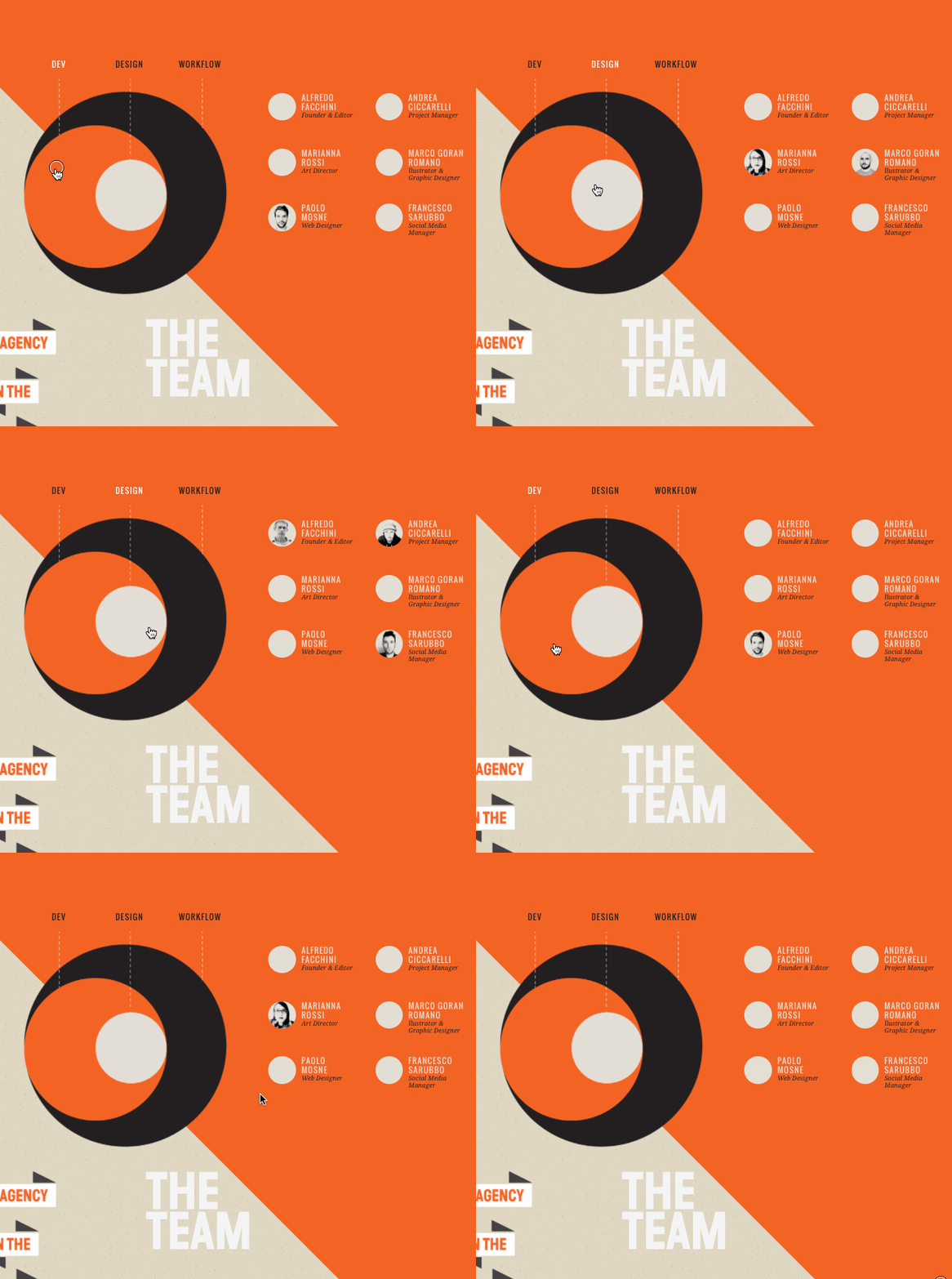
Wanting to show viewers how their small team collaborates on projects, Soup created a very cool interactive diagram for their team page.
They divided the circle into three sections: dev, design, and workflows. When you hover over one of the segments, the team members associated with that particular branch pop up in the circles to the right.
It's a very cool, creative way to exhibit their process and showcase how each team member contributes to projects.
Electric Pulp
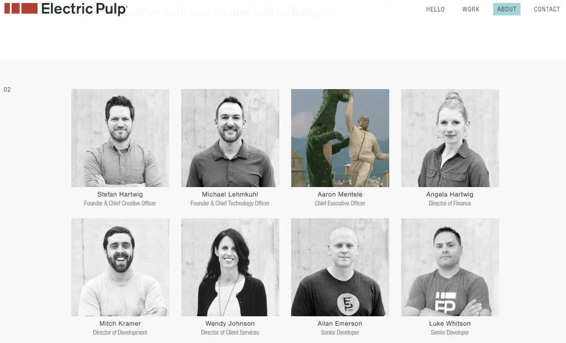
What if your team members had their own favorite GIFs, movies or other content they could show off in their bios? Electric Pulp team members add a great slice of personality in their team page photos.
Rethink
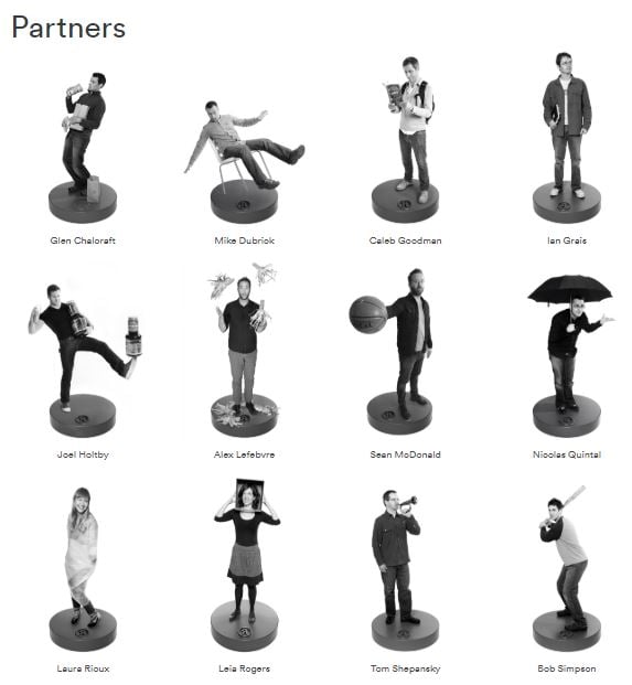
Over at Rethink, the team shows off some serious personality with what feels like minifigures of each person.
If you can get your employees to show off who they are, your website visitors will feel more comfortable getting to know the people behind the brand. Plus they might even have something in common, like a love of baseball or reading!
Digital Marmalade
Not only is their name sweet, but their team page truly knocks it out of the park! Digital Marmalade, a creative agency in the UK, adds a new dimension to the bios. Click on a face and you get their industry stats, personal notes including a childhood photo, and their superhero.
Showing off the people in your brand endears people to it. And when you can do so much with technology, why wouldn’t you?

Lateral
Lateral is another agency helping businesses grow. And they’re showing off a whole lot of personality and design skills on their Lateral team page!
The way each person follows the user’s mouse is absolutely mesmerizing.
FCINQ
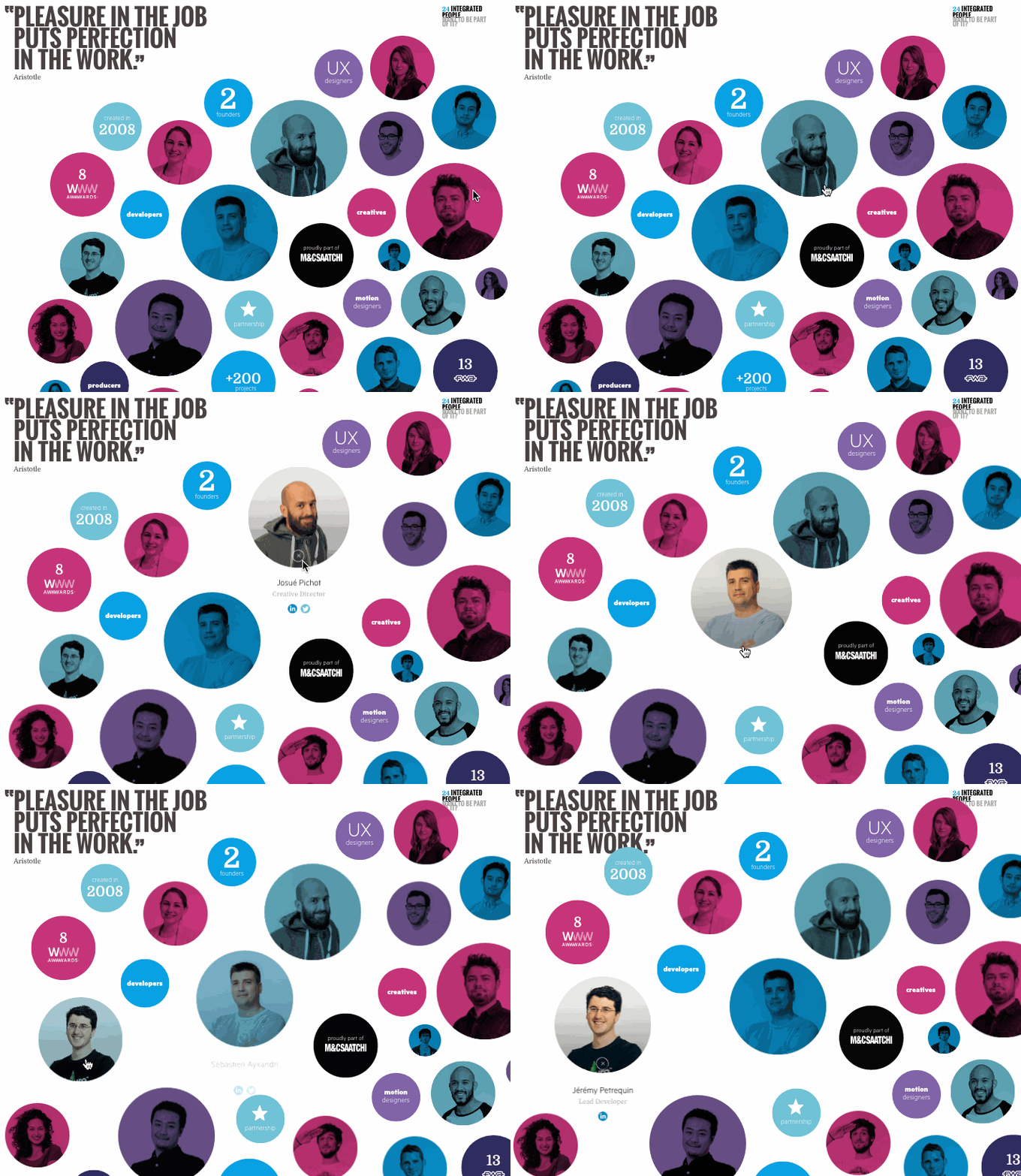
FCINQ, a creative studio in France, introduces viewers to its team with a collage of colorful bubbles. It feels a bit like a word cloud.
When you hover over an employee's individual circle, you get a zoomed-in effect. Clicking on it expands their headshot with their name and social profiles. It’s a modern, stylish alternative to the expected rows of team photos and names.
Stink Studios
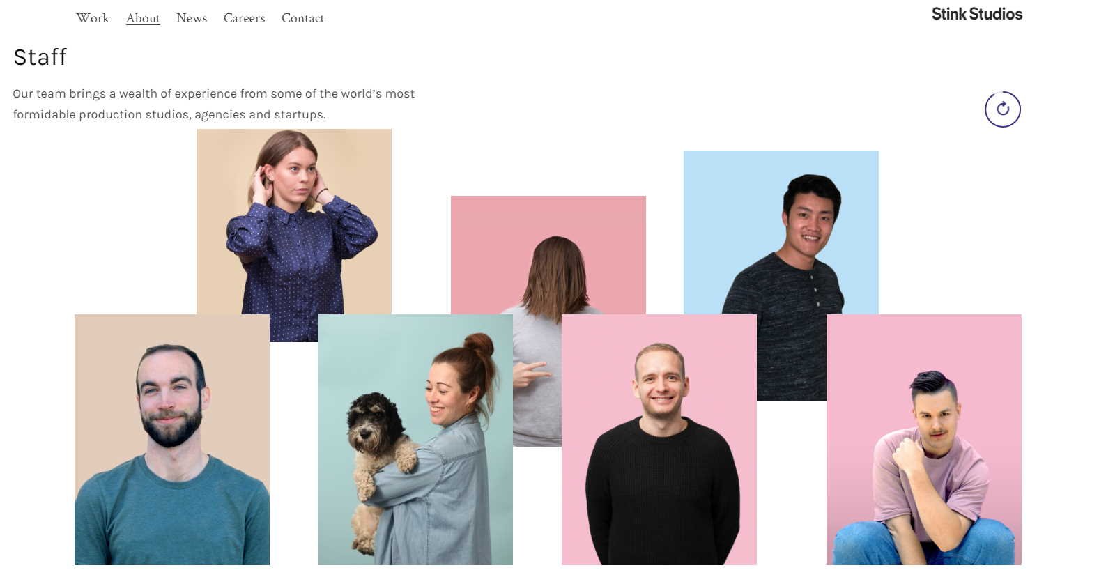
The beauty in the team page at Stink Studios is its simplicity. The entire “about” page is beautiful, and they include terrific glimpses into life there.
Then at the staff section, viewers see a few photos at a time, in a great layout with beautiful colors. The photos then change as you stay on the page. Well done.
LiveChat
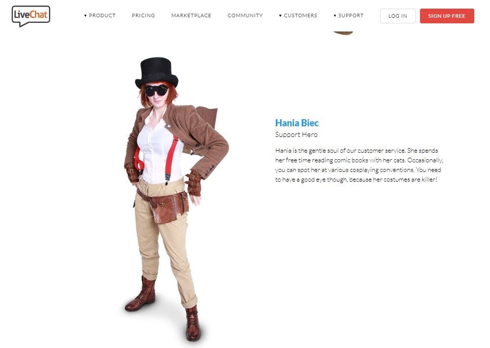
The folks over at LiveChat offer a great insight into their company culture and the lives of their team members. From Halloween costumes to hobbies to Cosplay Conventions and Renaissance Festival costumes (and more), the team photos all tell a story. And they make you want to need support from the service!
Drexler
The team page at Drexler, a creative company for sure, shows off the cheeky nature of the business.
You’ll want to visit the page for the full effect, but the photos, page design and user experience all add up to a team page you don’t want to leave. And when you do stay, wait for the clock to appear and change the entire feel again.

What Makes a Great Team Page
You’ve seen some of the favorite team pages we have here at Impulse Creative. But what makes a great team page?
- A great team page is digestible. You can get to know the team quickly.
- The best team pages get your attention. And hold it.
- A terrific team page humanizes your brand.
- Amazing team pages show off your brand’s personality, values and differentiator.
- The very best team pages make the right viewers want to take the next step with you.
Factors like storytelling, design, functionality and technology all play their part in making a kickass team page. Who are you working with to create your story?
Team photo by Perry Grone on Unsplash

