I delete much of the email I get. I don’t even open most of it. I really don’t even remember why, or when for that matter, I signed up for much of the marketing correspondence I receive in my inbox each day. Don’t get me wrong though: I think emails are good. And people do open them: 20%, according to Mailchimp.
I like the format as both somebody who consumes email and designs it. I suppose I’m just picky about what I spend my time on. So IMHO, to entice a user to open an email, it has to be three things:
- Sent by a trusted source
- To the point
- Useful
The latter two are results of the first. We only know email content is useful, and to the point, when we have opened it. And if you’re like me, you probably only open email from a brand or business you trust. So a good first impression is super important when it comes to the design of marketing emails.
Earning the coveted prize of your customers’ email address is not to be taken lightly.
Good email design can evoke an emotional response and trigger an action. And by design, I mean the whole thing: from subject line to call-to-action copy and photography to brand elements.
I’ve collected a few emails below that serve to illustrate my point. Each makes use of things like tone of voice, color palette, and visual design in clever and consistent ways. In spite of being designed with different intents or goals in mind, these marketing email examples should provide some great direction for your next email marketing campaign.
America’s Test Kitchen’s Sharp Focus
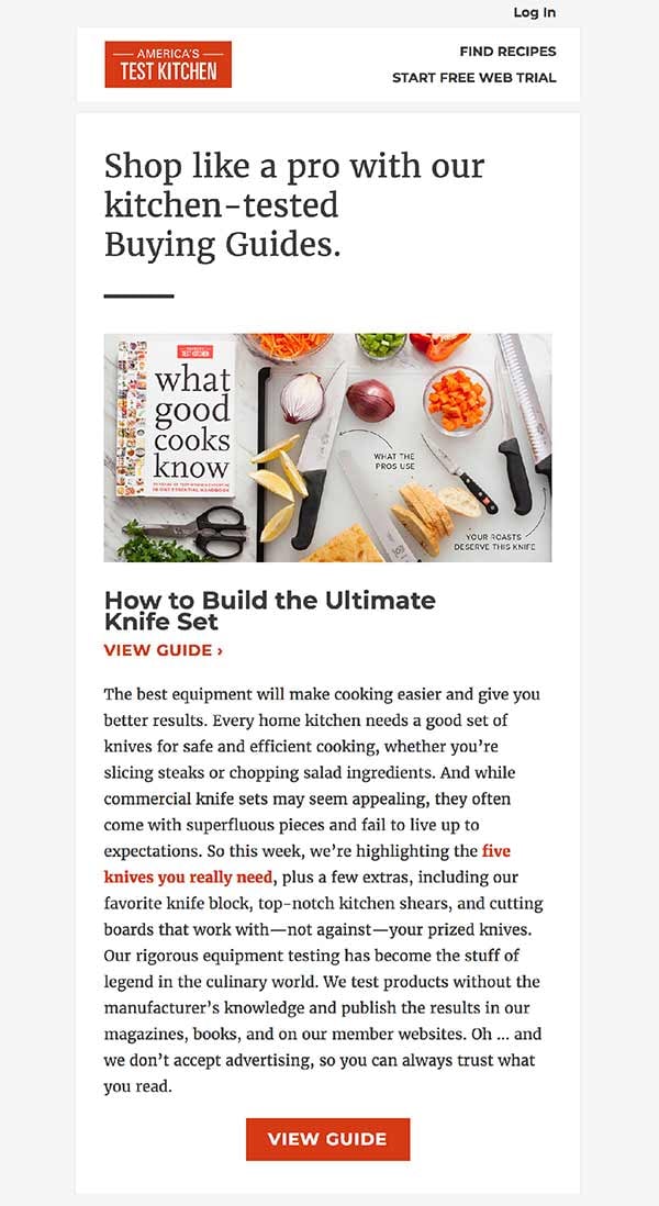
Just because America’s Test Kitchen has published countless cookbooks and produced big budget television shows doesn’t mean they don’t send marketing emails designed to get you to click. I recently received an email from them that featured a kitchen knife buying guide - and nothing else.
The design of the email supports this singular focus by presenting the call to action in a uncluttered layout. An engaging header photo, large, easy to read copy, and a subdued color palette focuses attention in a few spots. The use of the warm, red-orange brand color draws the user to conversion opportunities– namely links and buttons.
DJI’s Visuals Soar
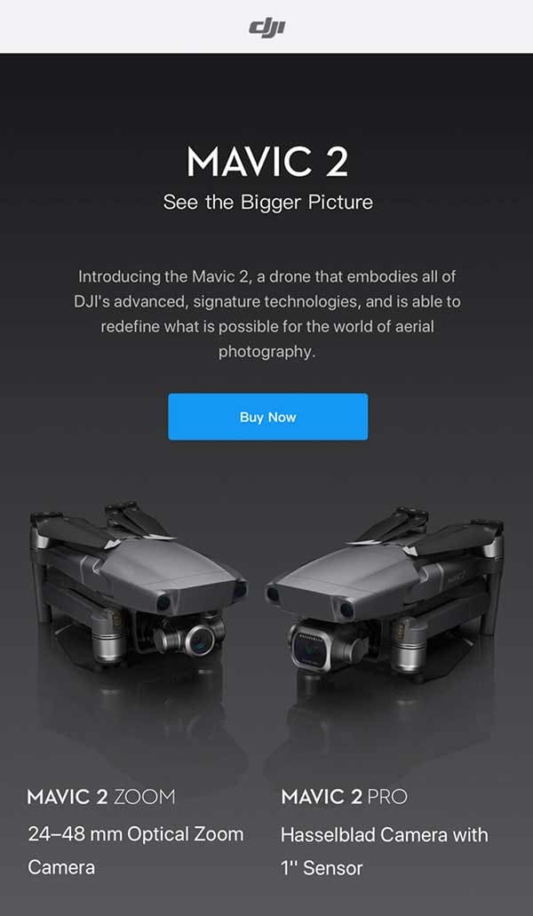
I’ve never given my email address to drone maker DJI, but maybe I should! This email design is simply gorgeous. I almost want to unnecessarily drop a few hundred bucks on one of these grown up toys. This email was actually forwarded to me by Impulse Creative’s very own Marketing Astronaut (working title) Ryan VanDenabeele. I’ll let him say a few more words.
Me: This looks great Ryan - any particular reason you like it?
Ryan: The modern technology feel, it just makes you want to buy a drone. Their brand tells a story...that story is to help you tell/show your own creative story with aerial video and photography.
Ryan possibly represents one of DJI’s buyer personas. Counts photography among his hobbies, 18-45 years old and with disposable income to spend. The quick copy, sexy product photos and the clear call to action make this a good example of the perfect email sent to the perfect person. Why distract your users with extra links or a list of your entire product catalog? Get yourself an email design that amplifies a straightforward message.
Restoration Hardware Takes Rugs Seriously
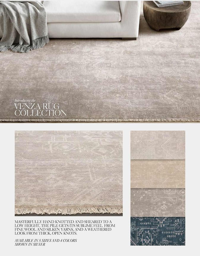
Like much of what Restoration Hardware does, their email design is elegant, sophisticated and chock-full of high-quality images. When looking at the email it’s almost as if you can feel the texture of each rug featured. I’ve never purchased a rug over the internet. But high-quality photos do a great job of filling in when you can’t get your hands on the real thing. This email has a lot of wins, but does suffer some losses.
While the email design uses great photography, there are slightly too many photos. This email is long. (The screenshot shown is actually clipped.) And with no clear call to action, it’s not immediately obvious where a user should click. The simple color palette actually hurts the email in this case. A button that contrasts nicely with the surrounding elements would go a long way to improving click through rates.
Dollar Shave Club’s Cheeky Copy
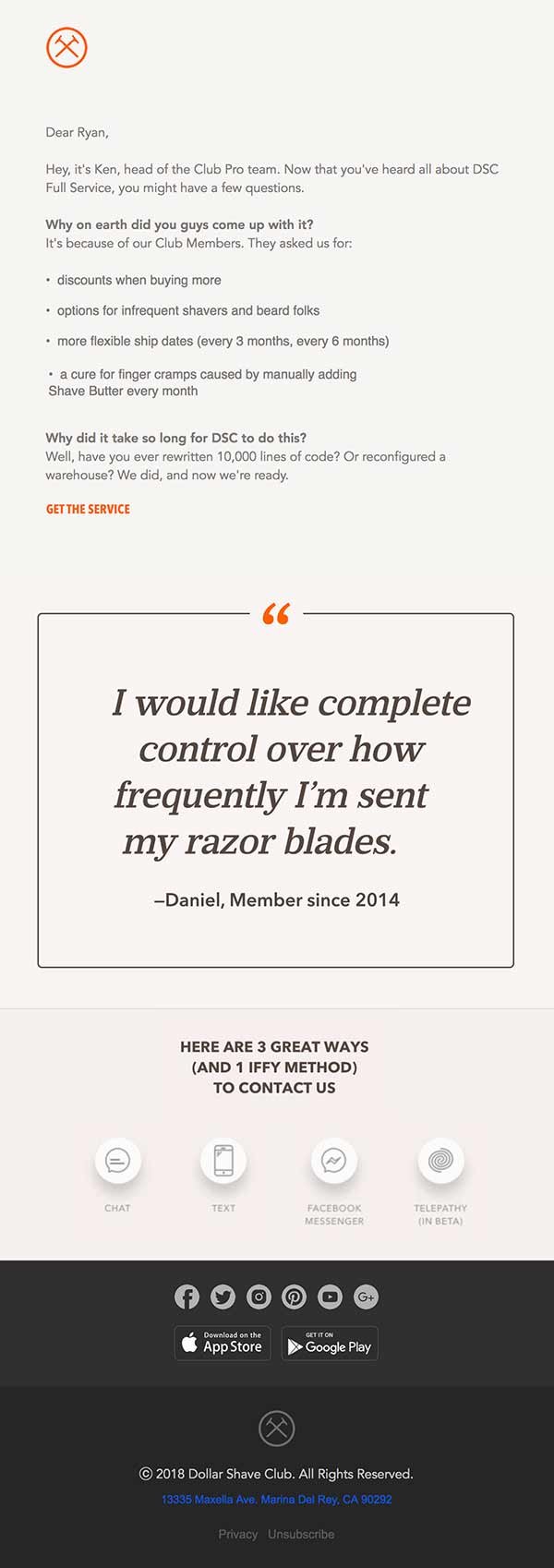
Another email shared with me by our marketing astronaut Ryan is this example from Dollar Shave Club. The design is sharp and crisp and straight to the point. Kind of like their razors! What I really love about this email design is the testimonial smack dab in the middle. It screams at you. We all know the power of social proof, and so too does Dollar Shave Club. Using the voice of a satisfied customer to help further their brand voice– and help sell razors.
The real shining success of this email however, is the copy. Dollar Shave Club’s tone of voice is legendary. Everyone remembers the viral video the brand launched with. They don’t let up in their emails either. From the messaging up top, to the Contact Us section near the bottom, Dollar Shave Club makes sure even the most utilitarian parts of their email are on brand. This email is a great example of how everything can be designed in your marketing emails, from voice to visuals.
Next Steps
If you’re experiencing little to no return on investment in your email marketing strategy, it could be because of your design. However, using the examples I shared above, you might just find a few key takeaways to experiment with. Thinking critically about every aspect of your marketing emails– from copy to subject lines to brand visuals– can help you build trust and keep your place in your customer’s inbox. As a consumer myself, some of my favorite emails to receive are the helpful ones, such as newsletters focused around a specific interest, discounts and coupons from favorite retailers. Many of these emails come in handy. And as long as they’re well designed, I’ll continue to open them.
So don’t stop sending email. Just start designing them better.


.png?width=600&name=Webinar%20Thumbnail%20(3).png)
