At Impulse Creative, we thrive on growth. It's even one of our core values. Like any growing company, we’re presented with opportunities and reasons to reflect on who we are, as we evolve and refine our brand.
The Cobbler’s Children have No Shoes
It’s famously difficult for companies to execute their own services for themselves. At Impulse Creative, we've never had a problem with drinking our own kool-aid (yea, it's orange!)
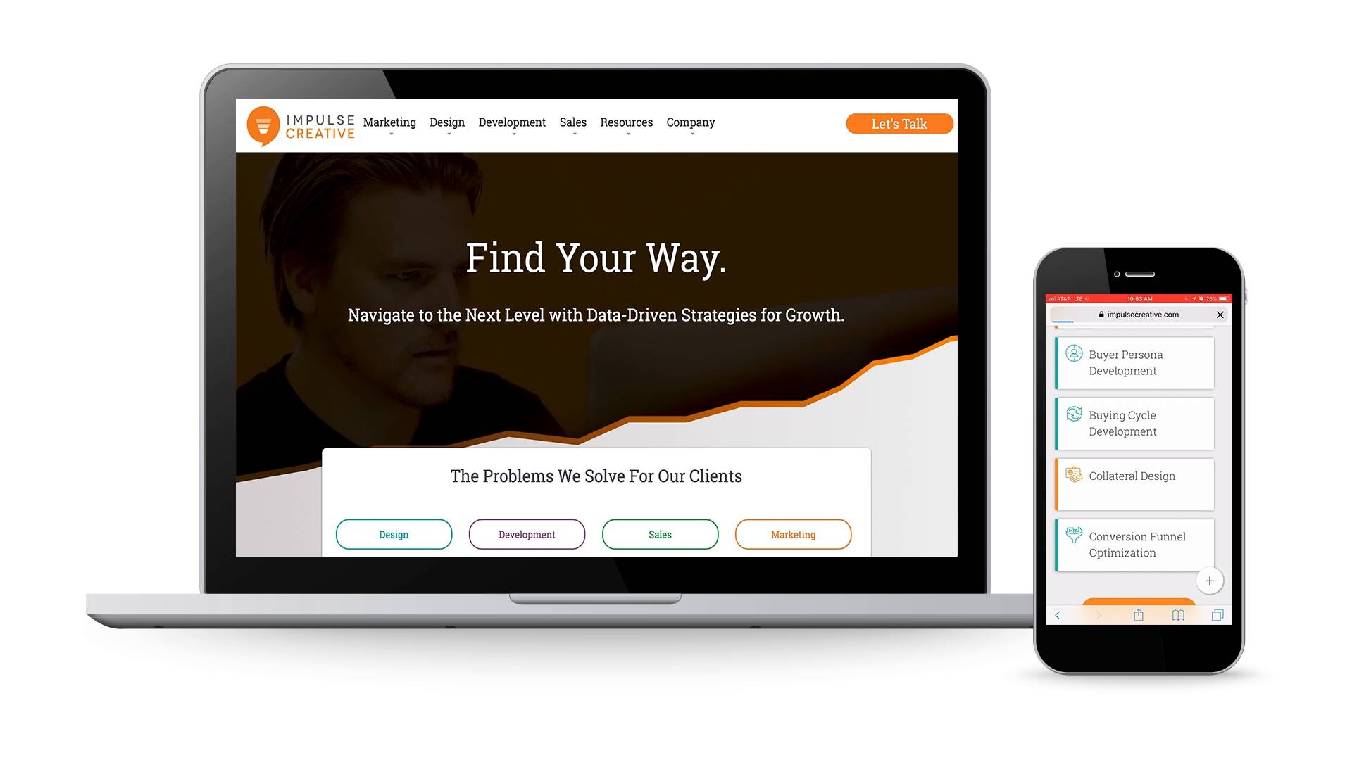
So, when we recently decided that changes and growth warranted a website redesign, the team did a remarkable job treating the project just like it was for any other client. From our defined design and development process, to content interviews for every page, our in-house flexed their creative muscles and went through every part of our client process for the fully redesigned www.ImpulseCreative.com.
Since the last visual redesign of our website, three years have passed, our company has matured and the industry itself has changed.Our sales process and communication no longer matched what our website said, so it was time for a big change.

Thanks for reporting a problem. We'll attach technical data about this session to help us figure out the issue. Which of these best describes the problem?
Any other details or context?
Why we decided to overhaul our online experience:
The Nature of our Business has Changed
When we began offering inbound marketing services, we were part of a couple hundred partners worldwide. Since then, the ecosystem has changed dramatically (and so has the competition). It’s more important than it’s ever been to differentiate ourselves.
Our Sales Process Began to Change
Over the past couple years, the way inbound marketing works has changed. Although our sales process and service delivery constantly adapted, the way our website explained inbound marketing and campaign tactics didn't change. While our blog remained a right resource for the latest industry direction, the site content we relied on to drive conversions began to weaken as the way we work strayed even further from the way we explained it.
Client Pain Points and the Benefits of Working with Us
Our last website redesign, about three years ago, was a big visual refresh. For the most part, the content didn't change. So essentially, we were still communicating the pain points of 4-5 years ago, focused on validating and explaining the inbound marketing methodology. Nowadays, inbound marketing is more widely known and no one needs to prove it works. However, there’s now a big misconceptions that it's a "service" you can buy.
It’s not.
It's a way of rethinking all of your marketing, sales and delivery. We were missing a big opportunity to do that and showcase every facet of the work that goes into a successful inbound campaign.
Implementing Video was a Clunky Experience
In 2017, video became an essential medium that marketers (and business owners) could no longer ignore. We responded by hiring a full-time video marketer to fulfill this need and serve our clients. Unfortunately, our website didn’t respond as well to the video marketing boom. Uploading, sharing and displaying videos was nowhere near as easy as it was on other platforms. Sure, we could have messed with embed codes and gotten it done, but with the technologies available today, why not make it easy so that our team can spend more time doing what really matters?
Not Enough Trackable Conversion Areas to Measure Interest
Modern marketing is focused on solving a problem for your consumers. In order to solve your customer’s problem you have to consider and understand the context of each buyer. Your website can be an invaluable tool to measure this intent.
The problem for us was that our old site only had about six pages capable of showing the intent of someone interested in our services. From a sales perspective, this made it difficult to measure interest everywhere but our top of funnel marketing content.
Refocus on Brand and Buyer Personas
While completely rethinking our online presence, our team analyzed how clients looked for services to help their business. Unlike past years, "inbound marketing" wasn't the big answer to their problems anymore, reaffirming our entire redesign project and direction.
By focusing on a more buyer-centric experience, we were able to create an experience that matches how our customers are inquiring about services. We rethought the entire navigation, and restructured every page of content to lead with the “why” of our services, not the “what”. This strategy adapts to consumers who are more educated than ever before, who are searching looking for a solution to specific problems and a fresh new way to look at them.
A New Domain for Brand Fortification, not Fear
Many companies view domain changes as a scary, afraid that they’ll lose rankings on Google and other search engines. While that’s a valid concern, it doesn’t have to be a problem.
After a lot of thought, we decided that a new domain was absolutely necessary for us, in order to maintain the integrity of our brand. So we shifted our entire site from our old domain chooseimpulse.com, which we've used for almost 5 years, to our new home, impulsecreative.com.
By analyzing our own situation, fully understanding the risks involved and moving forward with strategic due diligence, were able to achieve a great outcome for Impulse Creative and develop a successful case study for our clients.
The Results
The only requirement of our team for this project was simple: completely rethink the website from the ground up, with NO CONTENT MIGRATION.
So what happened?
Well, the only thing more remarkable than the site they created has been the public response. In just one week, Google has re-indexed our website with rankings for the new domain are increasing in areas we didn't have exposure in, with rankings steadily holding in areas that we already known for.
An Accurate Representation of our Brand
Our new website captures the unique essence of our team, our culture and our brand. Whether you visit our website or walk into our offices, you'll find a brand that is vibrant and consistent everywhere you look. Part of that brand experience was leveling up our design by eliminating ALL of stock photos throughout the website (with the exception of the blog).
Shift to a Video-First Strategy
In 2017, the Impulse Creative Client Success Team adopted a "video-first" meeting strategy. All meetings and client communication were on video, to keep us at the forefront of this major shift in digital marketing. Armed with the right professionals, equipment and strategy, we were soon primed to handle the full-service video needs of our clients and beyond. So, as the website came together, the timing was perfect to bring our own website into the video world in a major way, creating an online showcase of our vast new video capabilities.
A Seamless User Experience
Customer-centric marketing requires a website built around what the customer is looking for, and 100% focused on providing that information as easily and quickly as possible. The mobile-first approach to site building allowed us to cater to the growing mobile user base, while more granular service offerings provide valuable resources and capture attention.
Each page was designed with at least 2 opportunities to convert (for "mofu" and for "bofu") as well as a live chat via HubSpot Messages to assist or answer any questions our prospects have.
Reaching Goals with Strategy and Methodology
The Impulse Creative website now boasts 40+ service pages and a wealth of industry-related content. By outlining the activities needed for a customer-centric marketing campaign, we were able to create actionable, lead-nurturing workflows, actionable sales conversations and provide resource links available on the fly.
Utilizing HubSpot Technology Enhancements
Our website is one of the first to be launched using HubSpot's new Design Manager. In addition, we've utilized all of the technologies that HubSpot has to offer, in order to create the most seamless user experience possible. This includes various uses of HubDB, Smart Content, Meetings and Messaging tools. (Keep an eye out for a more technical blog about what we've accomplished there!)
Major Upgrade on Reporting
What gets measured, gets improved. We've connected various technologies to track the effectiveness of the website and our marketing.
One key tool in this is Databox. We've set up a few dashboards that rotate in the office all day, connecting the best data from Google Analytics, Google Search Console, SEMrush, HubSpot and Wistia. Detailed reports help us to fully understand the top pages, the top videos, and the top lead sources, all from one intuitive dashboard.
Flexibility to Expand
Our new website this is just the beginning. We’ve built the entire site based on the principles of the Growth Driven Design methodology. As we get more questions, have more videos, or incorporate more services, our web pages, layouts and reach can be easily expanded and evolved. This allows for us to be more agile than our competition by bringing new services to market faster.
It's Your Turn
Let's make you our next case study. Are you thinking about a website redesign? Let's have a conversation and discuss a Website/CRO Audit for your company. We'll uncover all the things you need to do to transform your website into a well optimized growth machine.


