 The website for your brand is the new storefront. This is where people get their first impression of you. With the right design for your web page you can show that you're the expert in the field. 'Above the Fold' is the first thing that you see when you come to the homepage of a website. In the past years the suggested practice was to keep all of the important information in that area, and avoid having the client scroll down, but the trend and this type of design has changed. Today companies are now designing websites that go on for days and keeping what is viewable to the reader very simple and eye catching. To stay on top of the trends and prove you are an innovative and user friendly business check out these 5 Steps to an awesome Website ReDesign.
How to Design Below the Fold
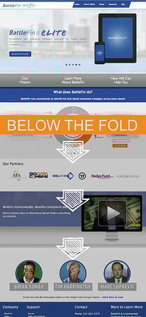
You always want to stay on top of the newest trends, so throw the fold out the window. Stop worrying about how much information can fit in your screen size area and more about how informational it is for the viewer. You want to keep the important information above the fold because we want the visitor to know what you do. You have 5 seconds or less to make an impression, so make sure that they can understand what you are offering immediately on your website without them having to scroll. But don't be afraid to put additional information further down on your website. For example, see this website to the right for BattleFin or click this link to view their website. It has the appropriate information above the fold, but it still makes you want to scroll down to learn more about the company.
Multiple Interfaces
It is important to have a web design which works for a computer, tablet or phone. As we are now moving into an era where you can search for information on your watch or through your glasses, it is important to take this technology into account. If a user cannot access your information from multiple channels you will lose traffic.Top Technology
One of the latest website re-design tips is working with the use of retina screens. A smart brand will build their page so that it can be streamlined with the latest technology. There is a need for companies to move quickly when it comes to staying on top of technology trends. You do not want to be left behind your competition because of a lack of technology.Easy Navigation
Companies often put the navigation on the side or the top of the page. When you are designing your page, opt for navigation bars which are fixed. As the user scrolls through the page, the navigation bar will travel with them. This is a convenience that the user may not cognitively think about but will appreciate, and may be something which encourages them to visit your page on multiple occasions.Make It Appealing
When web pages began they were simple DOS based pages. Now that the technology has grown by leaps and bounds, it is easier to make a page more enjoyable to look at. The colors which you use and the images placed on the page speak to your brand. Is there a big project which you just completed which has a stunning image? Is there a great picture of your office at sunset? Add a large background picture to make your page more appealing. Not only is this visually interesting, but it can set you apart and make you memorable.Staying on Top of Design Trends
Keeping your web design up to date with the latest trends will help you stand out as an innovator in business. Many of the latest website re-design tips are for ease of use. The more accessible you are to your customer, the better it is for your business.

.png?width=600&name=Webinar%20Thumbnail%20(3).png)
