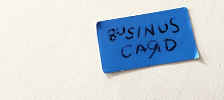
Most business cards are boring as hell. A small slip of paper with some numbers and text on it, that we’re supposed to hold on to and reference later? Count me out. I don’t even keep receipts, and I technically pay for them.
Business cards are boring. They just are. We hand them out at professional networking events or leave them in a stack at the front desk for visitors to take with them. And that’s where it ends. The rest is up to fate. In the age of the internet, some would argue the business card is as outdated as a landline. I’m here to tell you it only seems that business cards are dying because we’re letting it happen. Bad design can kill any creative endeavor and business cards are no exception.
But how can you ensure your business card wont get left behind or tossed in the garbage? To get a business card people won’t want to throw away, takes a little creativity. There are a number of design elements you could experiment with to make sure your business card makes the right impression on behalf of you and your brand.
Go Dark... or Use Color. Anything but White.
Most business cards are printed on white paper and use black ink. YAWN. As such, they’re destined to blend in with the rest of the business cards on the bulletin board or the ones shoved into a fish bowl for a free sandwich. Instead, why not explore a business card design that features a dark background or is printed on colored paper?
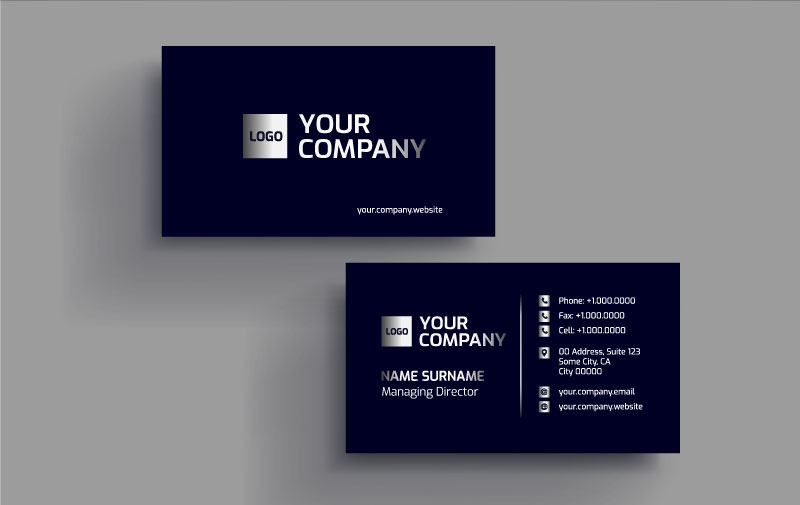
There is just something about a nice dark blue or satin black that conveys luxury. I’m looking at you, American Express Black Card. A simple design change like this can take your business card from forgetable to fantastic. Just make sure you’re using a color that works within the confines of your brand identity. Also, make sure you have enough contrast. Imagine using white lettering on a black card. When placed next to the other guy’s, yours is sure to stand out at your next networking function.
Explore Different Shapes
Who says your business card has to be the industry standard 3.5 inch by 2 inch rectangle? Sure it’s probably the cheapest solution, but is “cheap” part of your brand identity? At Impulse Creative, our business cards are square and feature rounded corners. People love them and always give positive feedback immediately upon being handed one.
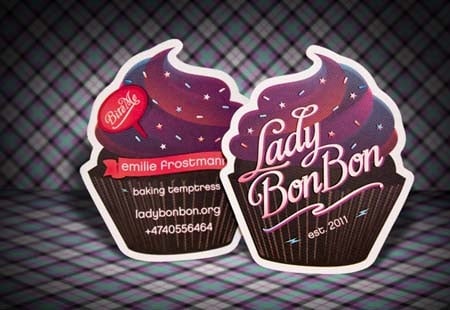
There are a variety of fun shapes you can use in your business card design, if they fit into your industry. If you own a soap company, explore rounder shapes like ovals in your next business card design. Non-traditional shapes are eye-catching and can go a long way toward creating a first impression that is unique and memorable. If you own an aquarium supply store, shape your business cards like fish. The possibilities are endless.
Having die cut business cards are definitely more expensive, so be mindful when exploring unique shapes for your business cards. When you think of the long term benefits, brand awareness and brand equity, the initial upfront costs may be worth it.
A Picture Is Worth A Thousand Words
Sometimes your name, title and logo aren’t enough. To get yourself a memorable business card people won’t throw away, try incorporating photography into the design. Full photos on one or both sides of your business card give people something to look at.
If you’re a photographer or artist, this can be even more appealing design element, as you can use the opportunity to showcase a glimpse into your work. To take it to the next level, you could even employ variable printing to create a set of business cards that feature a unique image per card. Business card printing services like Moo and others do this really well.
But what if your product isn’t visual? Don’t fret, you can still incorporate photography into your business card design. Think headshots. With the rise of social media, our faces are everywhere– from photos on our Facebook page to professional headshots on our LinkedIn profile. The same can be applied to your business card.
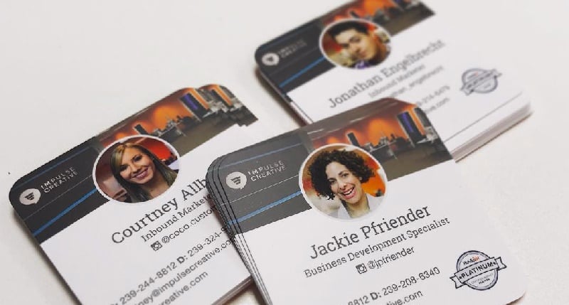
There is only so much somebody can convey from a name. Sometimes it’s positive, and sometimes, unfortunately, it’s negative. But a smiling face? That can be reassuring. Incorporating photography into your business card can work to your advantage: people like to match a face with a name. Just make sure it doesn’t look cheesy, so no selfies here! Incorporate a classy black and white photo or a professional headshot to keep it looking professional.
Change Up the Feel
Eighty pound card stock gets boring quick. But that doesn’t mean paper is cancelled. There are plenty of options for making paper pop. You could experiment with thicker paper, embossed elements, or even a more raw, natural looking cardstock that features charming variations sure to make each card in your set unique.
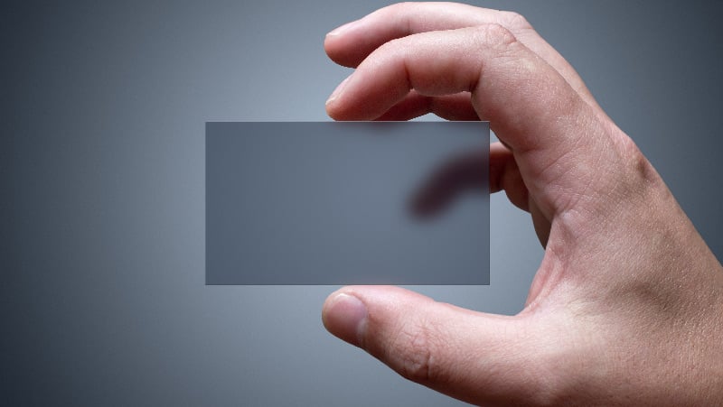
Another option is plastic business cards. Plastic is becoming increasingly popular as a material for business cards due to its durability and endless applications. Really, any material other than paper will differentiate you from the competition and naturally steer the conversation toward yourself and your business. From metal to cardboard, the options for experimentation are endless. Check out these 60 examples of unique business cards.
Throw Conventional Wisdom Out The Window
Now I’m all for order. And the purpose of design is to make things easier, especially when it comes to conveying information to the reader. But, sometimes we have to push the boundaries just a bit. With your next business card design, be daring, be avante garde.
Alongside the usual suspects like your name and number, include something unexpected. It could be something as simple as your twitter handle. Or maybe it’s a “fun fact” about you or your business. The ideas are limitless. You could even go as far as to put your contact information around the edge of the card to force the viewer to interact with the card. Just don’t make them work too hard to get the message.
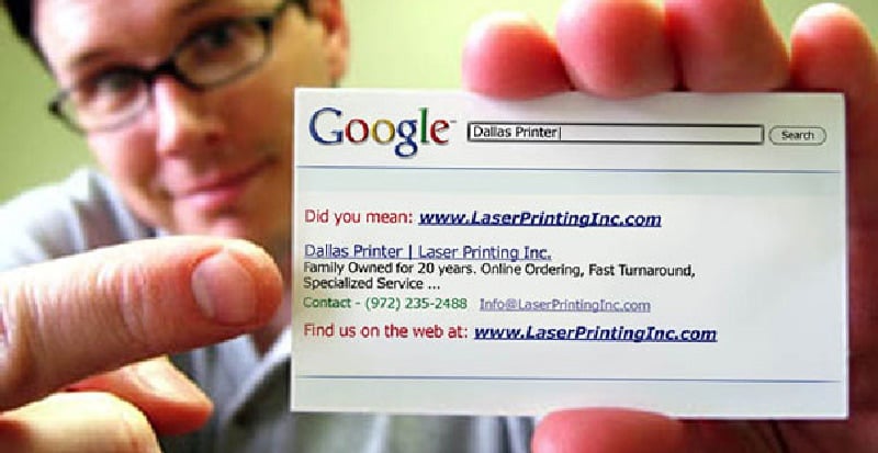
Mixing up the usual “name, phone number, email address” formatting in any way is sure to get people asking you questions. But be prepared if someone takes the bait and inquires about your business card design. Have a professional and witty response ready. For instance, if someone asks why your name is upside down on your card, you could respond with “Because that’s what I do to my industry!”
Really by combining any or all of the design ideas above you could end up with a crazy unique business card design that is sure to say you’re different.
Business Cards Aren’t Dead
The next time somebody tells you business cards are obsolete, tell them they are obsolete. Or maybe just politely suggest they lack creativity. When designed professionally, a business card can be your ticket into a prospects rolodex and into their memory. People still like business cards, and they like them even more when they stop them in their tracks.
Plus, if you pass out a creative business card that makes a great impression, that person is likely to show it to other people, putting you and your brand in front of even more prospects. But don’t just hand over any card, give potential leads and new customers an eye-catching business card that’s been uniquely designed.

