Close your eyes.
Now feel the wind on your face and the warm Florida sun shining down on you. You’re traveling on the Key West Express, taking you from Fort Myers Beach to the anything-goes island of Key West. Want to go for a ride?
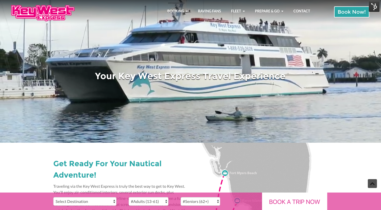
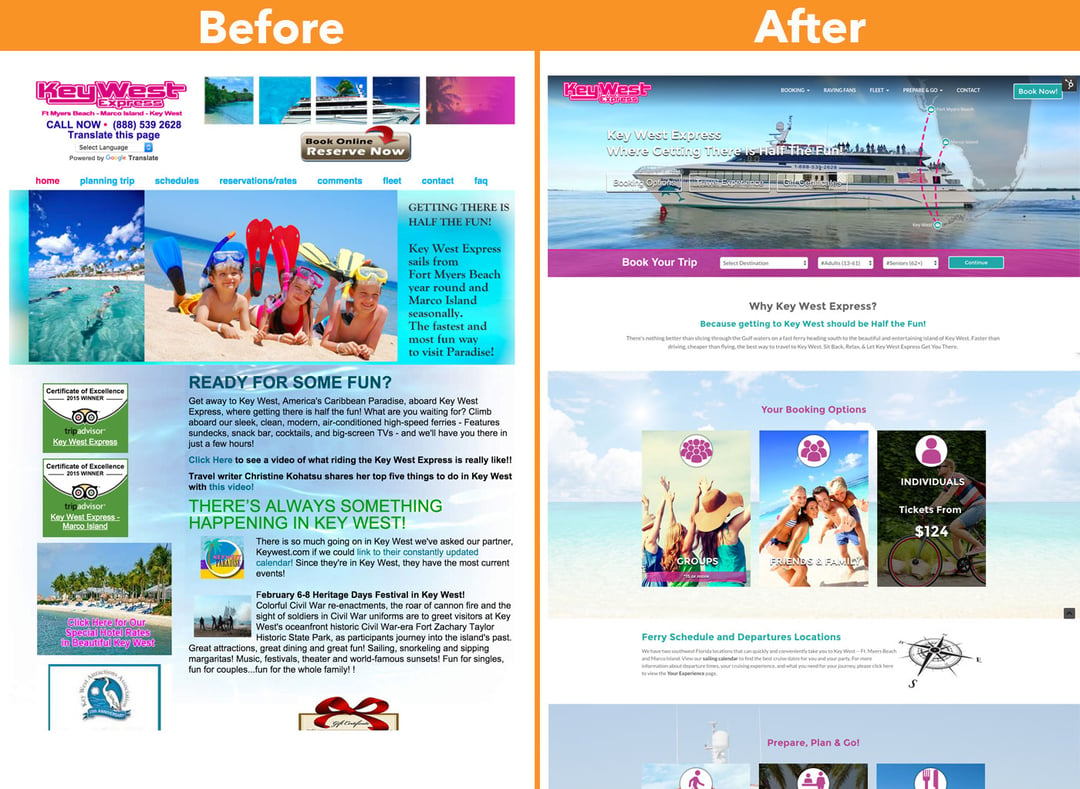
Our agency built out the new Key West Express website, giving it a much more experiential feel. We take you on the journey with engaging videos, attractive photos and seducing copy.
What the Client Wanted
The client wanted something that would have multiple ways for people to book, answer passenger questions, and give those interested a guide for their three destinations--Key West, Fort Myers Beach, and Marco Island. Many people who travel with them often stay the night in either Fort Myers Beach or Marco Island due to early departure and late arrival times. Those people needed a guide of places to stay, places to eat, and things to do.
We didn’t want to simply send them to another site to find that information or do a simple page with bullet pointed lists. We wanted to do something special and engaging, just like Key West itself.
The Difference Maker
We had to figure out how to make one section, the “Prepare & Go,” a place that acted has a guide for all three destinations, and then each destination would have the three categories--hotels, restaurants, and activities. Inside each category, each item would have it’s own page, giving the traveler useful information without leaving our website and giving us local SEO juice.
The solution was a framework of nine different blogs that worked together. Each destination displayed three different blog feeds, then allowed people to click deeper, looking at the entire blog category...of which was split so people could choose to only see specific items in that category. For example, They could be looking for seafood restaurants on the water in Key West and would be able to click the “Tags” of that blog section and it would display only those listings.
The Results
The Prepare & Go section is the second most landed on page, after only the home page. Then when we look into HubSpot Page Performance and take a look at blog pages, we see great traffic to these deep individual blog posts that are acting as guide information for the specific hotels and restaurants for each destination. But the best thing of all, is people are engaging with the “Booking” CTAs once they are on these pages. These page don’t have CTAs for more information to the specific item, it’s all pushing them to find the place they want to stay, good places to eat, and fun things to do. And then once they find the information they need, they are booking. The top three most visited pages have CTA click-throughs of 6.5%, 5%, and 5.5%.
The guide blog pages are driving people to book much more than we expected. We thought it was just going to be a place for information and SEO juice.
The Impact
The client goals of making an informational site that could give people a feel for what the travel experience would be like and push them to book was met. They now have a tool that has lowered the question phone calls which took up a lot of people time.
“After many years of research, Key West Express selected Impulsive Creative to deliver an engaging, creative & informative growth based responsive solution. We are delighted with the recent launch of our new site and look forward to continue to strategize with this dynamic team to fulfill our vision.” - Scott Schofield, IT e-Commerce Manager
It has created many more ways for people to book. We specifically designed several different styles of CTAs that would attract people at different stages of the buyer’s journey. A top-right “Book Now” cta, a booking bar like for the home page like a Travelocity would have, and a global booking bar that would present at all times on the bottom of the screen. This strategy has worked.


