Every night, after I’ve used up all my brain power during the day crafting exquisitely fantastic logos and super duper websites for our clients, like you, I Netflix and chill. I’ve binged everything from Mad Men to Breaking Bad and House of Cards to Orange is The New Black.
T.V. has the power to make us laugh and cry or transport us to other worlds. And Netflix is my rocket ship of choice. Sure, there are other streaming services I could choose, but somebody gifted me their password years ago and I haven’t looked back since.
On Netflix, I can find primetime programs of yesteryear and recently released Hollywood blockbusters. But one of my absolute favorite things about Netflix is their original programming. I mentioned House of Cards and Orange is The New Black, but they’re just the tip of the iceberg. Last month, I think all that I watched was original comedy specials produced exclusively for Netflix. Sets from Ali Wong, Dave Chappelle and John Mulaney had me literally ROTFLMAO (rolling on the floor laughing my ass off, for the uninitiated.)
Design has Increased My Brand Loyalty
With each new original piece of programming I consume (and thanks in part to their algorithm for discovering more content), my brand loyalty to Netflix increases ten fold. In recent weeks however, I’ve noticed something else that attracts me to the streaming giant: the design.
The user experience is wonderful. Search is intuitive, new content I actually want to watch is served up almost instantaneously, and the app doesn’t sacrifice any functionality whether you use it on the web, on the go or on the couch. I actually think it’s because of the Netflix’s design that my obsession borders on addiction. Netflix will probably produce an original documentary on its own cultural significance one day.
Yet still, aside from all the user interface design choices that improve the user experience, for my money it’s the typography of the original shows that really gets me to press play. From the in-your-face to the delightfully delicate, Netflix is using typography for its title cards in very new and exciting ways. Graphic design is playing a huge role in their continued success.
Below is a list of some my favorite Netflix shows complete with how each uses typography to compliment their respective storylines. No spoilers.
Last Chance U
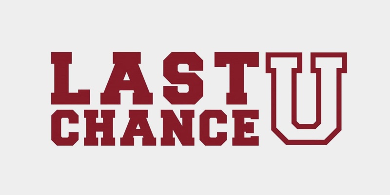
This serial documentary about down and out college football players vying for a second chance at fulfilling their NCAA division one football dreams is wonderful. Full of heart, grit and determination, it is only fitting the title design be as strong.
Netflix’s use of a letterman jacket inspired font is perfect for the content it’s designed to describe. The straightforward juxtaposition of the two smaller words - last and chance - flanked against a large “U” provide contrast and balance to a less than straightforward storyline. Finally, the choice to leave the “U” not filled in, suggests the characters in this story still have some growing to do.
Orange Is The New Black
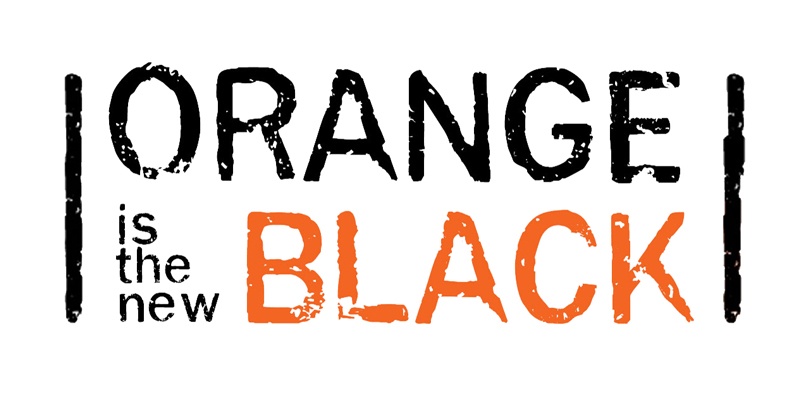
The often gritty, often sad, dark comedy Orange is the New Black tells the tale of a ensemble of inmates at a women’s correctional facility in upstate New York. Color plays a part in this design as orange is usually the color of standard issue inmate jumpsuits.
Another unique aspect of the type is it’s less than perfect nature. The visual grit in the title is a direct nod to the subject matter of the show. Rounding out the entire piece is a set of two black bars. And they’ve been put their intentionally, too. The bars help keep the inmat...err.. typography in place.
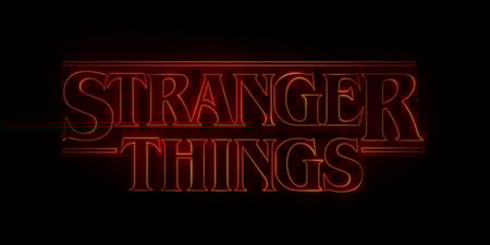
Stranger Things
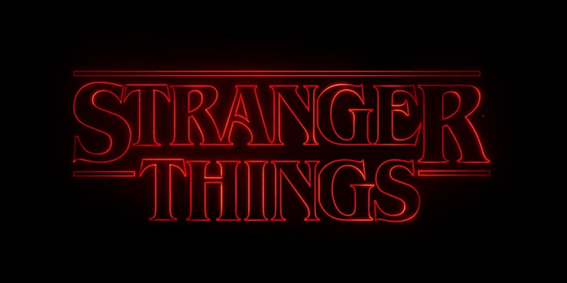
Much has been written about this ode to 1980’s movie folklore. Stranger Things follows a group of pre-pubescent kids living in a small midwestern town as they battle sinister government organizations, creepy crawlies, and their own adolescence. It’s everything you would expect if a John Hughes film had a baby with a Stephen King book.
And the typography doesn’t suffer. It actually looks like it was lifted right off the cover of a King novel. The title design uses a large serif font with each word stacked on top of one another, rendered in an ominous red glow. Design nerds love it! There’s even a Stranger Things title generator tool online. For an extra bonus, check out the opening credit sequence. The individual letters of the title are cropped closely and zoom into frame from all angles, playing up on the theme of suspense of the series.
Ugly Delicious
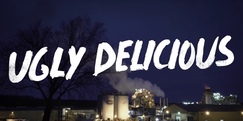
Following the culinary hot takes of James Beard, award winning chef and restaurateur David Chang, Ugly Delicious is the food documentary for cool kids. David Chang’s irreverent disregard for fine dining traditions of yesteryear combined with striking cinematography make for a delectable watching experience. (If you don’t mind a few f-bombs with your appetizer.)
The title typography works well to compliment Chang’s mission to discover and lift food that isn’t always as pretty as it is delicious. Featuring a quick, hand-done aesthetic, as if it were created with a paintbrush, the type is brash and bold not unlike the show’s host. A hand drawn look instantly adds street cred lending authenticity and approachability.
Black Mirror
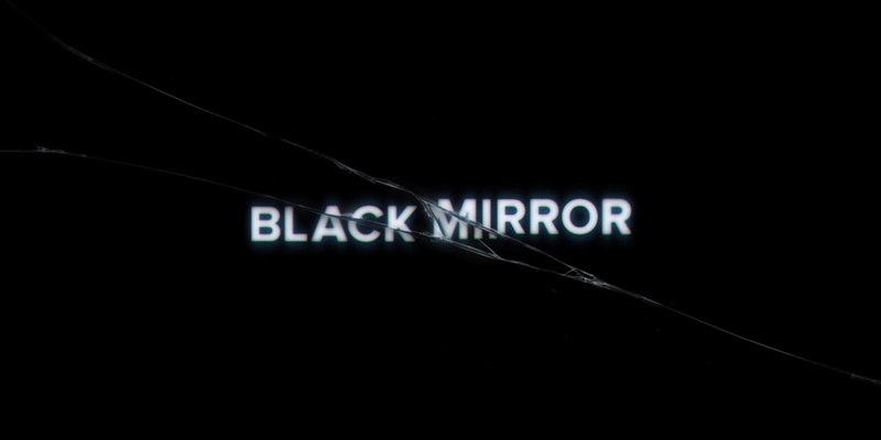
Essentially a modern day Twilight Zone, Black Mirror tackles the “what ifs” at the intersection of humans and technology in a compilation of stand alone episodes. It’s dark, as the not too distant future it predicts, highlights potential ramifications of society’s interdependence on everything from smartphones to social media. The “almost could be true” storylines and the moral fragility at the center of each plot line make for a curious suspense.
But before consuming each episode there is the typography. Like an image on a flickering television screen, the type greets the viewer before being distorted by a large crack. Displayed in an unassuming, straightforward sans serif typeface, the words Black Mirror channel the seemingly mundane everyday existence of your average human. The crack serves as metaphor for the altered state one finds himself in when staring blankly into a glowing screen.
Inspiration Can Come From Anywhere
As a graphic designer, I’m a very visual person. So I think my natural obsession with moving pictures comes as no surprise. With the rapid rise of easily accessible video content via streaming services like Netflix and Hulu, my appetite is satisfied almost daily. But it’s not all vegetating. I promise.
I find a lot of inspiration in the way these digital products are designed. In the case of Netflix and their original programming, I’m currently infatuated with how they are using typography. Browsing for something new to watch can be akin to going on a blind date. You’re not sure what you’re going to get. Because of their attention to detail and flair for typographic design, Netflix has made browsing for a new show a lot like picking a new wine off the shelf. The design of the label, or in this case, the title card, catches the eye and peaks curiosity.
Typography is powerful and if you want to learn more about what type can do for your brand, read my other article on the subject here.


.png?width=600&name=Webinar%20Thumbnail%20(3).png)
