An individual's first encounter with a brand is often visual, and at the center of that exchange is a logo. Because of this, your logo should command attention and resonate with customers from the outset.
Is your product strength? You might use shapes with hard edges.
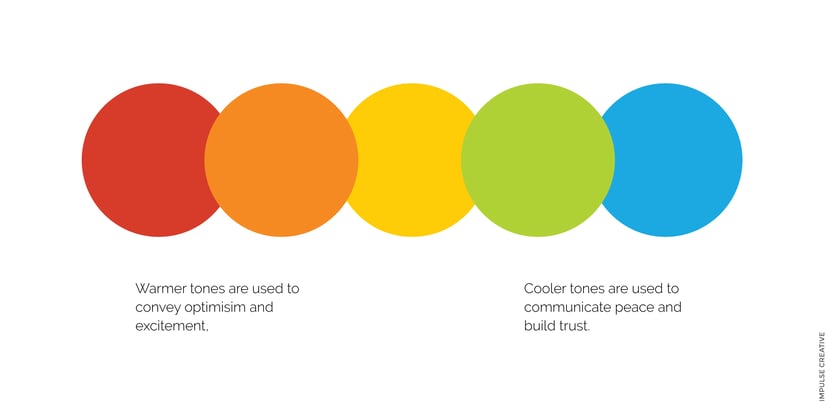
Is friendliness at the core of everything you do? Perhaps a bright yellow should be explored.
Reactions to a logo can range from confusion and disgust, to warmth and delight; and there are many factors that play a role in evoking those reactions. Shape and color are arguably the two most important attributes of any successful logo design.
I found I could say things with color and shapes that I couldn’t say any other way — things I had no words for.
Georgia O’Keeffe
The Power of Shape
Without even thinking, you can probably recall the logos of some of the worlds most iconic brands. A majority of your awareness of companies like McDonald s, Nike, FedEx comes from their logos. Sure, it helps that these logos are plastered everywhere - on the street and in your social feed - and that these brands have a history of clever and consistent marketing, but perhaps your connection is more than repetition.
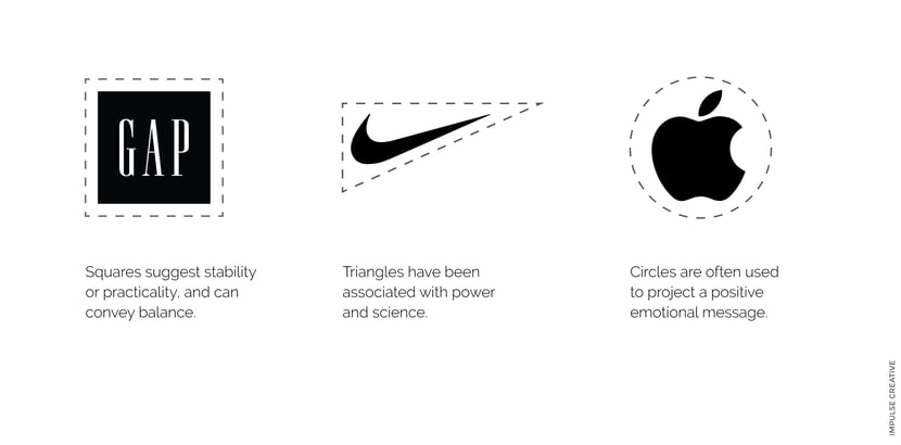
Perhaps a logo's ability to resonate with you is based on its shape. While it may not be the most noticeable character trait of a successful logo design, structure plays a huge part in establishing an emotional connection. Logos for brands like Nike or Apple are successful because they are easy on the eyes. They use simple shapes we have been familiar with as early as toddler hood. And every shape has its own weight and meaning.

Rounded elements in a logo may speak to a brand's inclusiveness or positive messaging. Harder angles tend to convey strength and consistency. Ask yourself this: If my brand was a shape what shape would it be and why?
For more on the psychology of shapes check out this primer from CreativeBloq.
Color or the Absence of Color
This is perhaps the most powerful feature of a logo design. And it can be the most detrimental, too. Individuals react to colors in different ways. As much research as there is about the psychology of shape, there is perhaps twice as much on color.
The easiest way to understand how somebody might react to your logo's color is to assess your own relationship with the colors that surround you in your everyday life. What color are the walls in your home? Why did you pick them? Looking at your wardrobe, what colors dominate? Dark tones? Brighter hues? More importantly, what do these colors say about you?
The color of a logo, or the lack of color, makes an impression almost immediately. Knowing which colors to use in your logo - and ultimately to represent your brand - is more difficult than throwing on a shirt or painting your kitchen however.

Color in your logo can be used to signify to a customer your intention and personality, and even compel them to take action. Take the color red for example. Immediately most of us think of hearts or sports cars; passion or speed. Merely seeing the color red has the power to increase the speed at which a human reacts.
Much has been written about color theory. If you're interested in learning more, our friends at Hubspot have written at length on the subject.
Making a Decision
Choosing the right logo design to represent your brand can be daunting, if you don't know what to look for.
By trainining your eye - or think back to your days kindergarten - to look at shape and color however, you can make an informed decision next time you're reviewing comps of your new logo.
If you're still seeing question marks, you might want to consider working with a dedicated design agency to ensure your logo adequately represents the mission of your brand.


