
A high-converting landing page requires a baker-like calibration to achieve your goal. Let’s break down the ingredients (aka our best practices for landing page optimization).
-
Use heat mapping to analyze on-page user behavior.
-
Take cues from high-ranking competition in SERPs.
-
Check load speed.
-
Balance simple and interesting design.
-
Review your calls-to-action for accessibility.
-
Lower the user’s mental load.
-
Clean up your forms.
-
Talk to your friends, talk to my friends, talk to me.
-
Make it personal to your brand.
-
Make it personal to your user.
-
Communicate unique value propositions.
-
Show off!
-
Remember: features tell; benefits sell.
-
Ensure CTAs are direct.
-
Avoid promotion bait and switch.
-
Spice up your thank you page.
-
Consider scarcity + timeliness.
→ Skip intro: Jump Right Into These Tips
What makes a high-converting landing page?
Well aside from our best practices, your mindset around your conversion strategy can make or break the success of your landing pages.
A conversion is the act of a user moving to the next step in the buyer’s journey. This is critical to maintaining momentum in turning passive users on your website into leads and leads into opportunities!
A landing page often holds the conversion your other marketing levers have been guiding towards such as subscribing to your blog, downloading content, booking a meeting with your sales team, or corresponding with live chat.
The metric for measuring conversion is CVR, which is calculated as the percentage of users who submit a form out of all the visitors to the site.
Each industry will have a different “high” converting page benchmark. Generally, 12% is a good goal.
To achieve a high-converting landing page, you need messaging alignment between with what the page is offering and the stage of the buyer’s journey, an eye-catching + responsive design, and a clear CTA.
While your audience's buyer's journey is mapped linearly from awareness to decision, it’s not realistic to imagine every sale will be from someone who converted through all your stages.
Need a refresher on the stages of the buyer’s journey? We’ve got you covered! Click to learn about ToFu, MoFu, and BoFu.
In fact, people can jump in at any time in their buyer’s journey. You may find most of your buyers just come to BoFu - that’s okay! While you can’t control when someone will interact with you first, you can make sure each landing page gives a great experience.
While landing pages will follow many of the same universal rules (jump down to read our 17+ landing page best practices and tips), there are some key distinctions based on what the offer ultimately is. Jump down to see a few examples:
Landing page optimization best practices and tips
1. Use heat mapping to analyze on-page user behavior.
Use a heat mapping tool such as Lucky Orange or Hot Jar to see how users interact with your landing page. This can inform content organization, CTA alignment/placement, and form optimizations.
EXAMPLE 1: Heatmap shows that 60% of your users aren’t scrolling past the above-the-fold view. Try placing your form above-the-fold, to see if this gets more form submissions.
EXAMPLE 2: Heatmap shows that users start the form submission but do not finish it. Try removing any uncessessary form fields.
EXAMPLE 3: Heatmap shows that users are clicking on unclickable text or areas. Try adding a CTA with more actionable language to direct users to the form.
2. Take cues from high-ranking competition in SERPs.
Sizing up the competition can help you uncover what SERPs and website visitors are expecting when they get to your landing page. From language and tone to layout and design, you can use this competitive research to improve your own page.
Look for ways to differentiate yourself from your competition. Are your competitors giving pricing up front or gating this information? Can you be more transparent to build trust earlier?
Are your competitors offering additional resources, testimonials or freebies on their landing pages that help add value to their offer? How can you stand out in this sea of competitive offers?
3. Check load speed.
Users want content, and they want it fast. Wordstream reports that even a 1-second delay in page load time can decrease your conversions by 7%. Decrease your load speed by compressing images and code files and avoiding duplicate content.
We recommend images be 300KB or less for optimal page speed and loading times.
4. Balance between simple and interesting design.
Designing a landing page that strikes the right balance between simple and spicy may feel like walking a tightrope, but it doesn’t have to! Stay consistent with your brand colors and assets, reduce your text with bullets and spacing, and make your CTA prominent.
Bonus tip! Use HubSpot’s A/B testing tool to see which variation gets more conversions. Try changes such as the offer itself, CTAs, images/videos, and form fields.
5. Review your calls-to-action for accessibility.
Where you place your CTAs, how big they are, and how they look contribute to someone actually clicking the button. Make sure you look at these elements on desktop, mobile, and tablet views (we love the preview feature HubSpot gives of this). CTAs should use active language as much as possible to demand a sense of urgency and action. Use your brand colors in your CTA and contrast them with the other page elements to distinctly pull the eye toward it.
6. Lower the user's mental load.
A major aspect of conversion rate optimization (CRO) is making it as easy as possible for the user to navigate. Users want to immediately know what your page is offering them. Limit competing CTAs, long paragraphs, and complex messaging (unless your personas love that).
Your user should know exactly what they need to do to get the offer and exactly what the offer is. Assume they will be scanning the page instead of reading every single word.
Bonus tip! Use "too long; didn’t read" (TL;DR) or key takeaways to simplify the information for users.
7. Clean up your forms.
The offer on your landing page may not be the issue; it may be the form itself.
Your form can be affected by the number or layout of form fields, the design of the form, the placement of the form, and the properties themselves.
For each property you want to include, ask yourself WHY. Is this necessary to qualify or is it just nice to have? One form doesn’t need to capture all the information you need all at once.
8. Talk to your friends, talk to my friends, talk to me.
Write your copy in alignment with your buyer persona’s vocabulary, education, and vernacular. If your buyer persona is highly technical, you can and should use terms and examples on their level. If your buyer persona is of a younger generation, feel free to use slang and cultural examples that are relevant and help you connect with them.
9. Make it personal to your brand.
For many of your landing pages, your key visitor base may be strangers (especially at the top of the funnel). It’s important to start building brand recognition by showing who you are, what you're about and how you want to help.
Tie your messaging back to your key value propositions.
Make sure your header and footer display your company name and logo prominently.
- Feature your employees, customers, partners and more to give your brand a human element.
10. Make it personal to your user.
Information you’ve collected already and stored in your CRM can be used in smart content and personalization tokens to demonstrate familiarity and partnership.
Bonus tip! Users like to hear about themselves to feel special. Speak directly to the user by using "you" as much as possible.
11. Communicate unique value propositions.
Users want you to differentiate your approach and expertise to fix their problems. Share how your company is uniquely positioned to be the right partner, particularly with landing pages that are opening the sale.
12. Show off!
Social proof ranges from client testimonials, quotes from subject matter experts, press, or name-dropping prominent clients. This tactic will demonstrate your ability to get the job done well and/or address user pain points with expertise.
13. Remember: features tell; benefits sell.
You may be proud of your features, processes, specs, and methodologies but users really care about how you will help them save time, money, effort, etc.
Does your weed wacker have three attachments (features) or does the weed wacker’s three attachments prevent the need for several different tools to tackle different types of terrain and areas of the lawn (benefits)?
14. Ensure CTAs are direct.
Your CTAs should have a clear action verb such as “Download,” “Purchase,” "Get Access," "Start," “Book,” “Call,” or “Choose.”
15. Avoid promotion bait and switch.
We love reusing a landing page for multiple campaigns!
But if your campaign messaging differs from promotion on social, email, ads, PR and more but all lead to the same landing page, your audience will be left confused — or worse think they landed in the wrong place.
16. Spice up your thank you page.
You may think your work is done once your user fills out their form, but the thank you page is another opportunity to put in a little delight and maybe even add a recommendation for another resource that can nudge toward the next stage in the buyer’s journey.
17. Consider scarcity + timeliness.
A limited supply or an ideal time to use the content/complete the offer can motivate users to take advantage of your landing page sooner rather than later.

High-Converting Landing Pages for eBooks
Educational materials, such as an eBook, are a perfect offer for a landing page because they are thorough and helpful.
So, how can you make sure that they actually submit that form on your landing page to get that amazing eBook?
-
Have a clear bold heading that tells them exactly what this material will teach them, show them, and/or help them achieve. (Benefit statements go a long way in building excitement and trust.)
-
Include a sneak preview on the page of the offer such as a video or a section of the ebook, so viewers know what to expect. (We love to use a flipping page GIF to add some interactivity and flair.)
-
Use bullets to describe what’s included in the offer. Quantify the value as much as you can. For example 17 tips, 35 pages of expert research, 100 statistics, etc. (After all, attention spans are only getting shorter)
-
Forms should have a low barrier to entry (think fewer fields and progressive profiling starting with their email, first name, and job title). Remember that HubSpot automatically fills in company details where possible - score!
As is a consistent theme for building landing pages, you need to make it as painless as possible for them to get what they need.
Don't forget the post conversion experience: Make sure that users can easily access the eBook by redirecting them immediately once they submit the form and sending an email with the link as well.
Want to level up your educational content experience?
Standout from the crowd and turn your long-form content into courses! Here are some ways to make your landing page stand out even more:
-
Offer a trailer video of the course as an overview of what to expect.
-
Introduce your author/trainer to build trust and authority
-
Define the learning outcomes or objectives of the course on the page in bullets.
-
Provide the time estimate for the course so users know how it will fit into their lives.
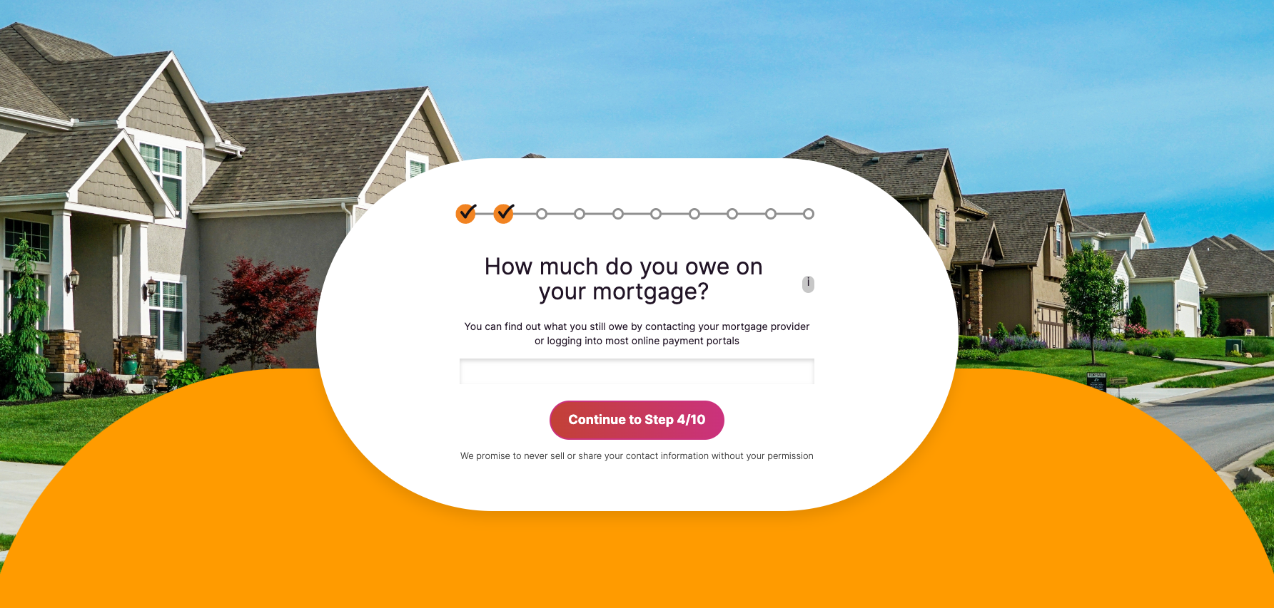
Landing Page Best Practices for Assessments and Calculators
Assessments and calculators are amazing tools for gathering information about your leads and prospects, building customized experiences and recommendations to provide a truly personalized offering, and avoiding form burnout.
Here are a few reasons why we love this type of content offer:
- It’s interactive.
- It gives you loads of context for your CRM in a natural way.
- The user gets a personalized output “just for them.”
So how can you position your course or calculator to make it irresistible on the landing page?
-
Show examples of potential outcomes from the calculator so people know what information could be displayed to them after inputting their personal information (This will help build social proof!)
-
Use radio buttons, short text, and checkboxes as much as possible to make the calculator quicker and easier to fill out. (This will help improve your conversion rate by lowering the visitor's barrier to entry and increasing the perceived value of completing.)
- Give a progress bar or step counter on your landing page to tell them how far they've gotten and how much is left before they get their results. (This will help prevent abandonment and boost your conversion metrics.)
Impulse Creative tip: Information you’ve already collected about your leads can be used to personalize copy and graphics on your landing page (we love you, smart content!). Be hyper-specific to pain points, industry, and growth goals.
Demo Landing Page Tips and Best Practices
First, you need to decide how you want to present your demo itself and what your value proposition is. Is it self-serviced with videos or interactive experiences? Is it more hands-on with a human from your team?
If a demo on a landing page is self-servicing, you’ll want to ensure the process is as intuitive as possible. Consider:
-
A video overview
-
Pop-up tips, best practices, and benefits
-
Interactive guides so people get the most out of their trial use
-
A place to ask questions or book a meeting to discuss (aka even deeper conversions)
If a demo will be conducted by someone on your team, consider the following on your landing page:
-
Calendar page with reasonably open availability for someone to book a time to talk as soon as possible.
-
Overview of what to expect in the call: timeline, items covered, agenda, etc.
-
Pre-demo resources
This is all about showing your product or service as the best option, best partner, and best solution.
Preparing for landing page optimization
To know if your landing page isn’t performing optimally, you’ll need to look at the following metrics:
- Session to contact rate (CVR) or lifecycle stage CVR if your goal is further in the buyer's journey
- Percent of page scroll (use a heatmap tool such as Lucky Orange or Hotjar for this)
- Time on page
- Bounce rate
- Returning vs. new visitor landing page activity
This is where using a tool like HubSpot makes finding this information seamless. Within the landing page tab, you can see at a glance almost all of the metrics we listed above.
You can choose the time period you want to see data such as when it first launched, after changes, month-over-month or all time.
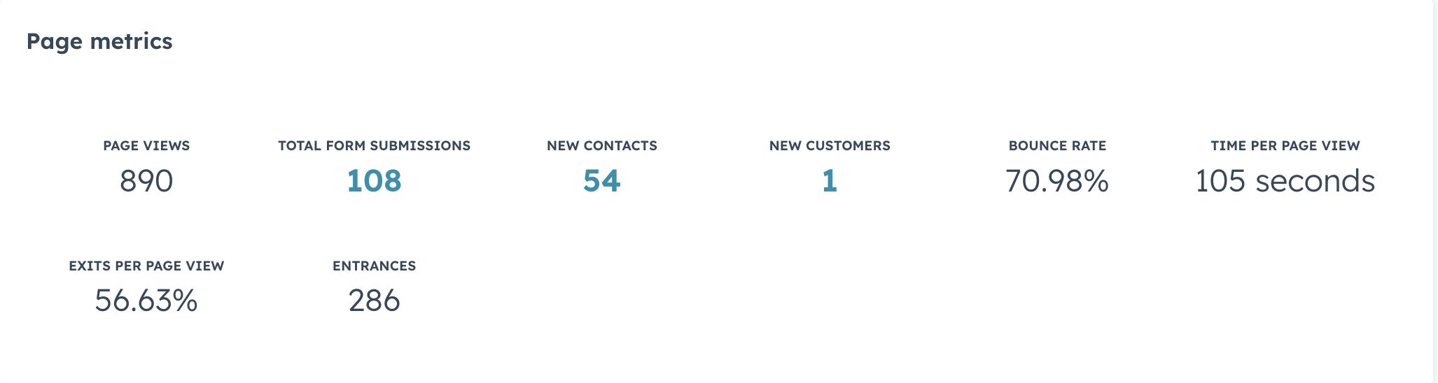
Page metrics are available for a published landing page.
You can also use this data to see WHO has become a contact from this landing page and then following their subsequent journey with our content. That qualitative data gives your numbers context!
- How did they get to this landing page?
- What did they interact with after?
- If they talked to sales, how did that conversation go?
Having these metrics tied to your CRM helps give context to what your users are doing and thinking, which takes the guesswork out of strategizing what to create or optimize next.
Moreover, you can also see in HubSpot the dollar amount associated with your landing page. This is a great way to quantify the success of your marketing efforts within the buyer’s journey.
-1.png?width=6815&height=1662&name=Revenue%20Attribution%20Example%20(censored)-1.png)
Revenue attribution is available for a published landing page.
Within each landing page, you can also see how people are getting to your landing page: email marketing, direct traffic, organic social, organic search, referrals, or other campaigns.
Use this information to check the health of your source traffic.
- Are your social media promos to this landing page effective? Should you focus on one channel over others?
- Are your SEO efforts driving organic traffic to this landing page?
- Which emails and CTA are most compelling? Do you need to look into the segmented audience, subject line, or messaging?
For example, when you drill down into social for a landing page, you can see which channel is taking people to the page, and of those people, who is actually filling out the form.
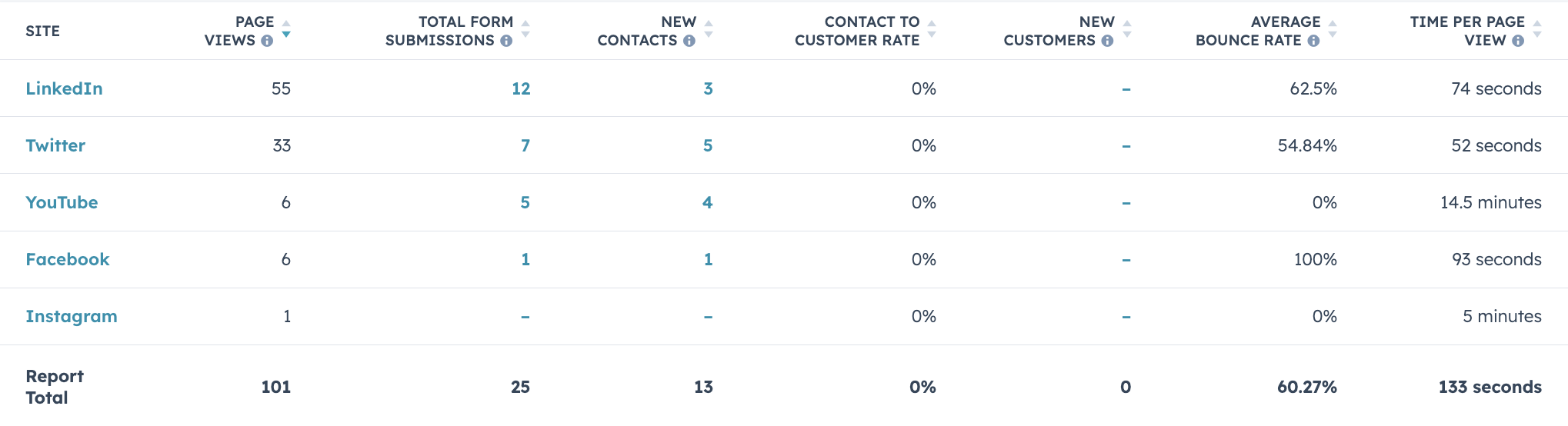
See how social media channels impact landing page traffic.
More data gives you more opportunities to ask more specific questions that lead you to the crack in the ceiling that is preventing your landing page’s success.
You’ll also need to make sure the problem is the landing page and not the offer itself.
Are people spending too little time on the page? This could mean your headline doesn't align with what they were looking for and they are immediately bouncing off the page.
Are lots of people viewing the page but few are converting? This could mean you aren't providing enough value or asking too much from your form submission. Maybe the page is too complicated or confusing.
Once you have established that you do in fact need some landing page optimization, you can start the planning phase.
Questions to ask before landing page optimization
A successful landing page optimization starts with reflection. Your landing page’s components are the foundation of your marketing strategy: your ideal customer profile, your buyer persona, their pain points, your qualification process, etc.
With your team, ask the following questions for your particular landing page.
| Who is this for? | What does your buyer persona care about? | What is your goal? | What do you need to qualify users at each step? | |
| Examples | C-Suite decision-makers, entry-level doers, people managers | Content to help them DIY, free sample or free trial, 1:1 consultation | Get as many leads into your database, book a time for a demo | Budget, tech stack, KPIs/goals |
You may find in this reflection process that these foundational aspects weren’t considered when you initially built the landing page. This will affect your language + positioning, your form fields, and even the offer itself.
We know a thing or two about high-converting landing pages
At Impulse Creative, our approach is exactly as we’ve outlined here: landing pages are not to be put on a shelf and forgotten about. Instead, landing pages must be consistently analyzed and optimized.
We love using HubSpot to save time on building the landing page, to test different solutions with the A/B testing tools, and to adjust layout and styles effortlessly.


.png?width=600&name=Webinar%20Thumbnail%20(3).png)
