
Everyone wants a beautiful landing page that performs like an Oscar-winning star. But even after constructing a gorgeous template and finessing the perfect messaging, your hard work just ain’t paying off.
Why is no one converting? Time to start trouble-shooting. Chances are, you can revive that clickless landing page with the help of a few core best practices.
Here are ten strategic ways to create better performing landing pages and get higher qualified leads:
1. Really Nail Down Your Audience & Their Goals, Not Yours
Before you start to write and design (or rewrite or redesign) your super-awesome landing page— pause. Mentally step away from all the ideas swimming around your head.
Take a moment to get deeply curious about your strategy, ensuring it’s rock-solid before making any moves:
- Who are you crafting this landing page for? // Are you clear on your target audience or persona? Hint: “All of my customers,” is too broad of a statement and will likely get you pretty low conversions. Get specific.
- Why should people want to convert? // Are you envisioning content that will speak to your reader’s “WHY,” or why they would be on the page and why they would want to give away their private info? Or, are you focused exclusively on the company itself or your own goals? Don’t get it twisted; this is about the reader’s reason, not yours.
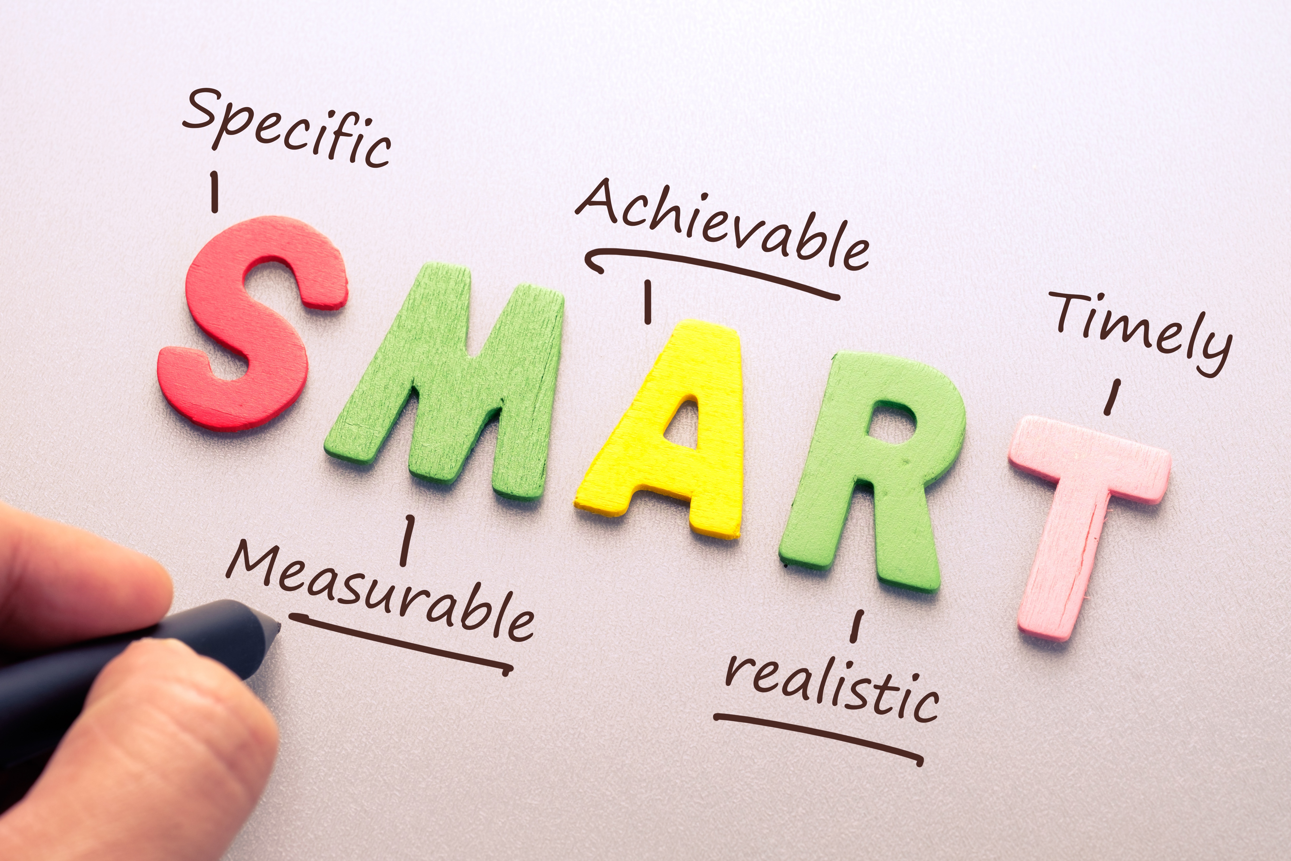
- What are your goals? // After you get clear on the viewer’s goals, don’t forget to integrate yours. Obviously you want conversions, but make your goals SMART by saying, “I want # of conversions by this date, with # marketing qualified and # sales qualified leads.” Integrate the landing page into a specific marketing campaign, if relevant, and connect it to your long-term initiatives.
Act as if you were pitching this kick-butt landing page strategy to your managers or your client; or by all means, actually show it to them and ask for recommendations. Iron out any kinks and address questions that could lead to some tactical revisions before drafting your landing page copy and creating any assets like content offers, etc.
2. Keep the Copy Less than 300 Words
Landing pages are usually quite short: showcasing light copy and limited visuals. Why keep it brief and simple?
The goal of a landing page is to convert, and lengthy or distracting content can lead to bounces.
Some people within the marketing landscape— like Neil Patel— argue that fewer words work best for low commitment decisions, like filling out a short form. But they believe there’s a time and place for longer landing page copy too, specifically when decisions require longer or higher-dollar commitment or if the perceived risk of sharing the personal info is higher. While this can indeed work, generally, short-and-sweet is the way to go.
If you have a lot to say, great— write a blog post or a webpage. Heck, if you have a ton to say, create a pillar page. You can include a link to your landing page in the call-to-action of any of those pieces of content! The idea here is not to rank for your landing page, but to instead rank for the blog/webpage/pillar where you link to the landing page.
Searchers typically need to be ‘nursed’ or led to an offer before they’re invested and interested enough to convert. They need to build trust with your company through helpful ungated content before considering handing over their personal info on a silver platter. Because the goal is for viewers to get all the juicy stuff from that longer page— and just go to your landing page to download an offer— writing more than 300 words starts to fall outside the scope of general best practice.
Slimming Down Your Content
Having trouble cutting the copy? Here are some tips:
- Fewer paragraphs and lists work great. // Break up large chunks in short, punchy sentences or add bullets for easy readability. Remember: your landing page mantra is “concise.”
- Nix filler words. // Leave your desk for a few hours and come back with clean eyes. Cut the fat! If you can say it in fewer words, revise.
- Consider adding a video. // Users are more inclined to play an entertaining and informative video clip over reading dense blocks of words. But don’t kid yourself: the video should be short-and-sweet as well to avoid overwhelming, boring, and losing the listener.
3. Don’t Make them Hunt for the CTA
After you draft up some super lean, ‘how-could-they-say-no’ copy, focus on your call-to-action (CTA). The CTA is what you’re asking readers to do on the landing page— often a nicer presentation of, “fill out this form to get this.”
Make your CTA more appealing with these best practices:
- Keep your request high on the page. // Whatever you’re asking of visitors, make sure the action-item is above the fold of the webpage. Scrolling reduces your chance of someone seeing it (especially if the page has no clear visual to indicate there’s more if you scroll— like downward-pointing arrows).
- Use an active verb. // You’re asking viewers to take an action, so use active language in your request. Try words like, “Download (the ebook),” “Request (a consultation),” “Enroll (in our email list)” over weaker or less specific action verbs like, “Get,” “Click here,” etc.
- Make it pretty, dammit. // Choose a vibrant, brand-specific CTA button color. If your call-to-action or landing page doesn’t match the style of your current website it can lead to distrust and abandonment, so keep design top-of-mind.
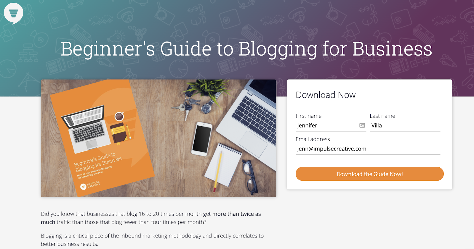
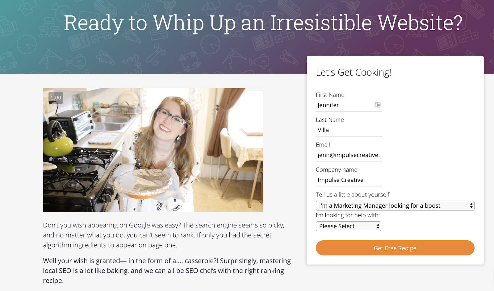
4. Adjust Your Form Fields Based on the Buyer’s Journey
No one wants to fill out a long form, especially if it asks a lot of personal questions. In order to get your landing page viewers to convert, it’s imperative that you understand where they are in the buying process, AKA their buyer’s journey.
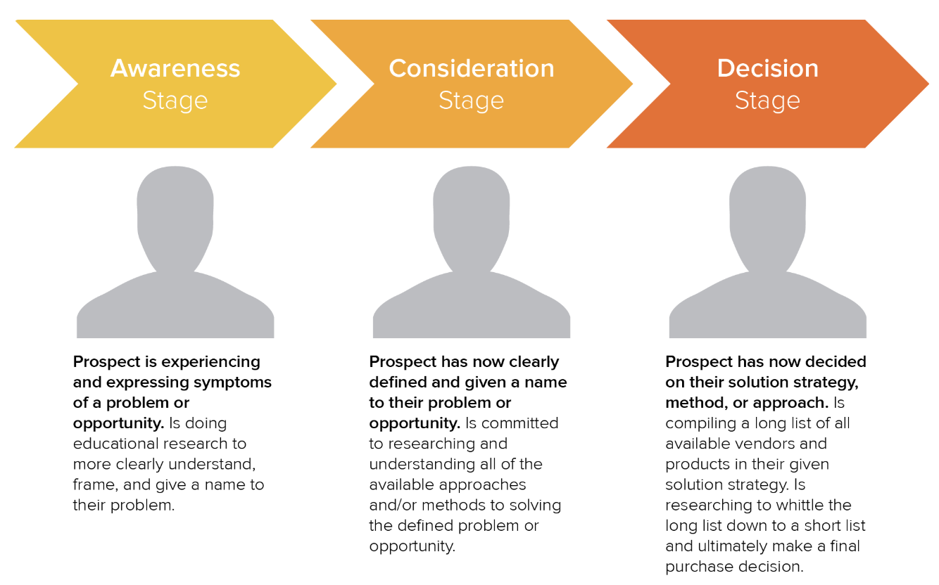
Awareness Stage
These peeps are just starting to recognize they need more information and pull up a Google search to try and find it. They’re problem-solving and not ready for a big commitment to get answers.
Example offer: A blog signup pop-up or a landing page for a lightweight ebook.
What they’re willing to share in the form: As fresh search meat, an Awareness Stager is probably not going to give you more than their name and email until they really start considering a solution.
Consideration Stage
After a prospect knows what their problem is, they start considering how they can solve it. Consideration Stagers are looking for thoughtful paths, approaches, and ways to do it themselves.
Example offer: A landing page with a how-to guide, case study, or maybe even a helpful webinar.
What they’re willing to share in the form: While these searchers are often more willing to give you more information for deeper insights, it’s still not the time to hit them with eight form fields (if there ever really is a time for that). You may already have their name and email from a previous Awareness Stage conversion; if so, ensure these fields autofill to save the converter time. Ask for one to three additional fields, like their phone number or company name, or unique questions to get to know them more.
Decision Stage
These searchers now know what they need to solve their problems. In many cases, they’re on your bottom-of-the-funnel landing page because they’re interested in your product or service.
Example offer: A landing page to try a demo, schedule a short introduction call with your sales rep, or to request a quote.
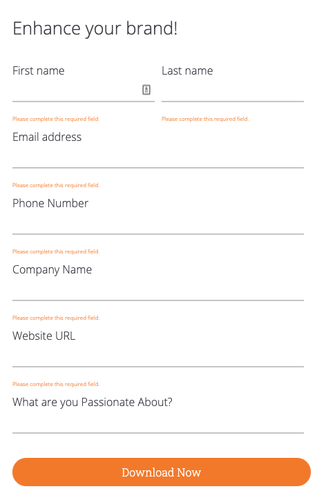
What they’re willing to share in the form: Decision Stagers are likely choosing between you and another company who can help them. They’re locked, loaded, and ready to fire! If you don’t already have the essentials— like their first and last name, email, company, website URL and phone number— be sure to get that now. Additional form fields should be focused on drilling deeper into their problem or bottleneck for closing the deal. Ask, “what’s your biggest challenge?” or about their budget.
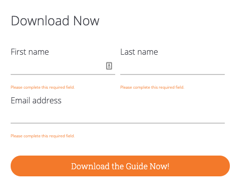
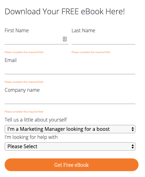
Here are some more examples of form fields in landing pages from Web Ascender.
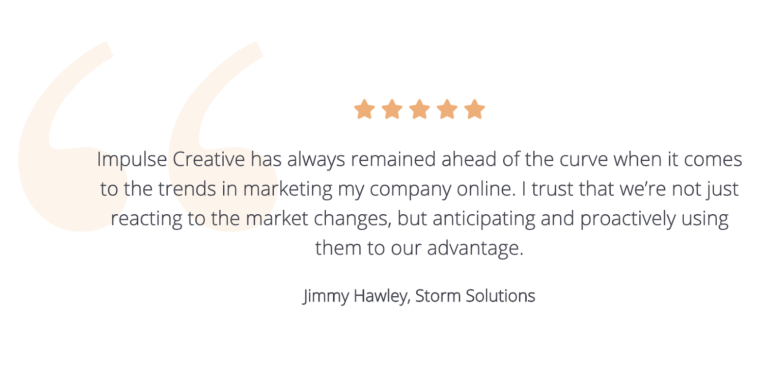
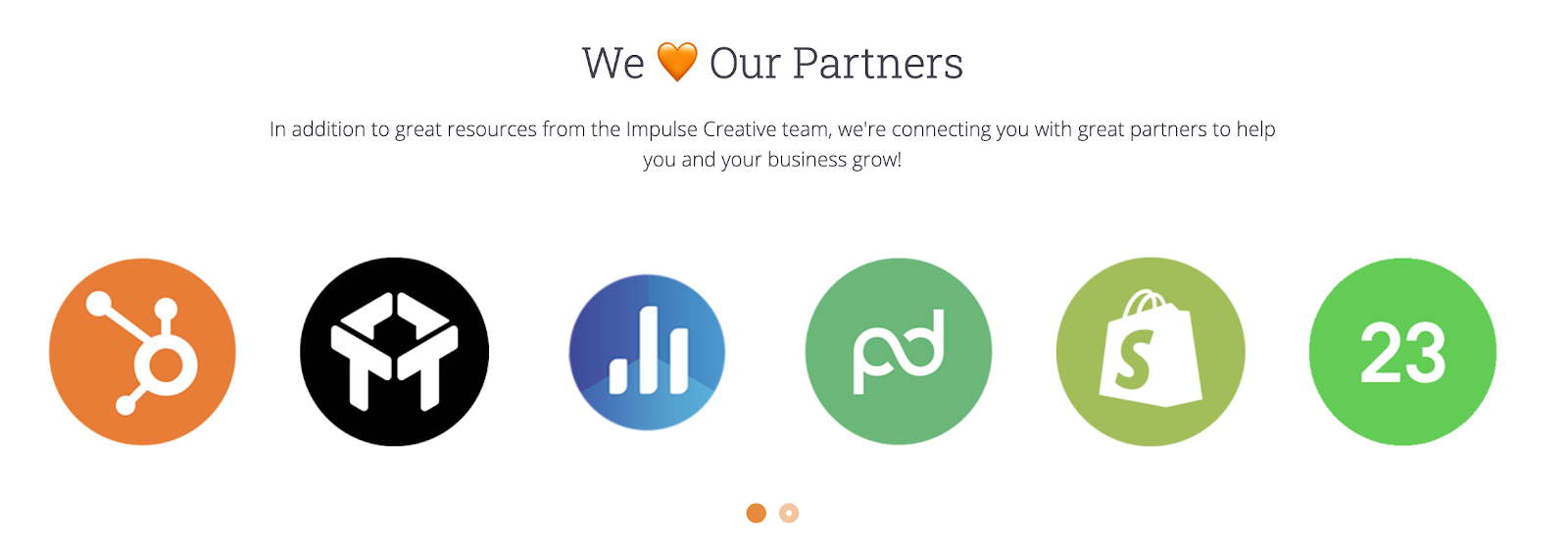
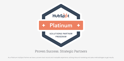
5. Include Social Proof
No matter what the stage in the buyer’s journey, people love to see social proof on landing pages. What do we mean by social proof? Basically anything that hints or blatantly displays that other people find your product or service great, since seeing others express interest is a simple way for your would-be customers to begin trusting your brand.
Display awesome testimonials in a scroll style across the bottom of your page:
Or, if relevant, show all the incredible partners you work with to deliver a remarkable product or service:
This is also a clever place to include awards to show searchers that prestigious companies within your marketplace recognize your value:
Include at Your Own Discretion...
Some websites include clickable links on their landing pages, taking readers to case studies, video testimonials, etc. to keep learning about their company. Or, they may display social icons with the number of followers or reviews that link out to popular platforms like Facebook, LinkedIn, etc. While these can be effective, we caution against clickable links on landing pages. Here’s why...
6. Remove the Navigation Bar & Internal Links
The whole point of a landing page is to get someone to convert. But human beings are easily distracted, especially when it comes to searching online! In order to keep your viewer hyper-focused on filling out your form, it’s helpful to remove any pesky distractions.
Internal links, while you wouldn’t assume to be ‘bad,’ can actually lead clickers down a rabbit hole— causing them to forget they were even on the landing page. We recommend removing any hyperlinks in the copy as well as eliminating your upper navigation bar to prevent site hopping.
Nix other distracting links too— like recommended products, recent blog RSS feeds, or linked images— to reduce abandonment.
7. Make it Visually Appealing While Staying on Brand
Even if you keep the text short-and-sweet on your landing page, people will bounce right off if they’re not visually excited by the content. That’s why the highest-converting landing pages typically have a strong visual appeal.
Add graphics to your landing page with these ideas:
- Choose a show-stopping hero image. // Landing page templates display hero images in all shapes and sizes, so pick a template that’ll show off your favorite lifestyle or textured image.
- Create a visual display of the offer. // If someone is downloading a virtual ebook or whitepaper, it can be hard to capture that in an image. Ask your designer to bring the book to life by illustrating a cover and making it look like a real guide that anyone could pick up at a bookstore.
- Include a video. // Instead of (or in addition to) an image, consider adding a short, helpful video to say more on your landing page without cluttered text.
- Use your brand colors. // Make sure to use the exact hex color codes your brand uses on the website, and that your landing page matches the same style, or else users might question its legitimacy.
8. Double-Check Your Thank-You Page & Follow-up Workflow
Now that you have all the copy and visuals in place and your form is all set up, ‘convert’ on your landing page as if you were a guest. Go through all the steps that your user would take by submitting the form, reviewing the thank-you page following these best practices, downloading the offer, and receiving any workflow triggers like drip emails, sales follow-up, etc.
Here are a few questions to ask:
- Does the download trigger itself automatically on your thank-you page? (or allow the users to receive it however you intend)
- Did you get an email providing a downloadable link to the content? (for those who can’t immediately download it after converting, like say, mobile users)
- Did your CRM actually capture the lead?
- Did their info come through properly? Any unclear or wonky form field problems to fix?
- Do the right people on your team receive an alert about the new lead?
- Did you set up a proper workflow to continue nurture them after conversion? Do you have proper leading scoring metrics set up to empower your sales and marketing team throughout future nurturing efforts?
You may be surprised by how many marketers don’t actually test their workflows, only to discover months later that one major hiccup in the process was the reason they weren’t getting any leads. Don’t be like those regretful chaps! Look for any bottlenecks your leads may experience now and immediately remove them before pushing the campaign.
9. Check Across all Device Types
If you don’t have a responsive website, your landing pages probably will look like crap on mobile! If a user has to pinch and zoom to read your copy or fill out your form, chances are... they’re going to bounce.
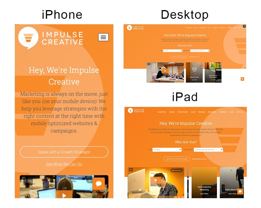
Be sure to view your landing page on various phone and tablet types as well as various sized computer screens.
You may need to adjust your page to improve the user experience. For instance, mobile viewers may benefit from a page with less copy and bigger buttons. You may also want to cut out larger images, which take longer to download and slow your site speed. Check out this advice from Wordstream on optimizing mobile landing pages.
10. Get Inspired by Those Who Are Rockin’ It
Inspiration starts with imitation, some say. Look up examples of awesome landing pages to start thinking about the design and functionality of yours. Take notes on what you like about some of the best-of-the-bests’ work. We recommend not only viewing the screenshots of the landing pages in compilation articles, but also viewing the live URL itself and playing around.
Some leaders in the biz push the limits on traditional landing page best practices, and while it can be exciting to experiment, be cautious of diverting too far off the path until you A/B test a few versions of your own.
Let the Professionals Optimize Your Landing Pages
It’s easy to write and publish a landing page; it’s harder to figure out why it’s not converting. While these ten best practices are a great place to start, there are folks out there who understand the anatomy of a high-converting landing page like no other.
Here at Impulse Creative, our Inbound Marketers create top-performing conversion funnels for dozens of clients. We’re versed in a myriad of industries and are dedicated to understanding the needs of your customers, testing solutions and building smarter conversion opportunities to land you better-qualified leads.
Explore our Conversion Funnel Optimization services, or take a stab at doing it yourself by downloading our Lead Generation & Conversions Strategies ebook.


.png?width=600&name=Webinar%20Thumbnail%20(3).png)
