
As the predominant visual mark of your brand, your logo deserves its due. You've hopefully invested equal parts time and money to get just what you wanted and now you're ready to release it into the wild. But will it be safe out there?
From the typography to its color and shape, the anatomy of your logo didn't happen by accident. A lot of thinking went into pairing fonts and selecting colors that helped create a mark. In time it will become the most important visual identifier for your business. And this mark’s success directly impacts your brand equity.
I previously pointed out the difference between a brand and a logo, but essentially it goes like this:
Brand - the emotional connection with your company
Logo - the simplest visual manifestation of that connection
When used incorrectly, your logo can lose its impact and negatively disrupt the connection you've established with customers; the equity I referenced above. A graphic standards guide can help to alleviate the guesswork.
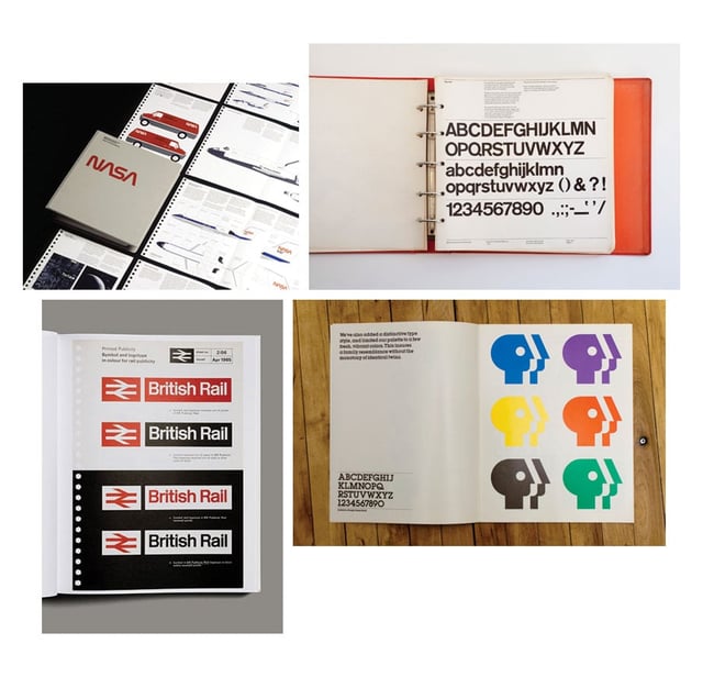
Some very thorough graphic standards guides.
Clockwise from Top Left: NASA, New York City Transit Authority, PBS, British Rail
What is a Graphic Standards Guide?
A graphic standards guide, a.k.a. brand style guide, a.k.a brand identity guide, presents an overview and best-use practices for the visual assets of a brand. Contents can include everything from stationery systems to environmental graphics, but at a minimum should talk about your logo and why it was designed.
If you'd like some inspiration, Logo Design Love has compiled a list of identity style guides from around the world. The list includes entries for corporate giants like Apple, Pizza Hut, and Walmart.
Be forewarned, many of the guides linked above are very in-depth. Walmart's guide goes even dictates how and when to use images in a 53-page juggernaut. Not every guide is created equal, however, and the one for your brand may not need to be long or complicated.
A simple graphic standards guide should include:
- A logo and breakdown of its anatomy
- A color palette with conversions for web and print
- A section on the typography used
- A how-to for using alternate logos
- A list of Dos and Dont's
That last bullet point may be the most significant. The Dos and Dont's of your logo will prevent headache and ire when you begin releasing files to printers and newspaper typesetters. As I mentioned before, the incorrect appearance of your logo can diminish its impact and negatively affect brand equity in the long run. When handing over visual assets to an authorized user, it's good practice to also share your graphic standards guide. Think about it. Would you let someone care for your children without telling them anything about the kids? (I sure hope little Sally doesn’t have a peanut allergy.)
Equipping individuals tasked with reproducing your brand's visual assets eliminates guesswork and potential design disasters. Your business is important. Use a graphic standards guide to eliminate room for mistakes when your brand is in someone else’s hands.


.png?width=600&name=Webinar%20Thumbnail%20(3).png)
