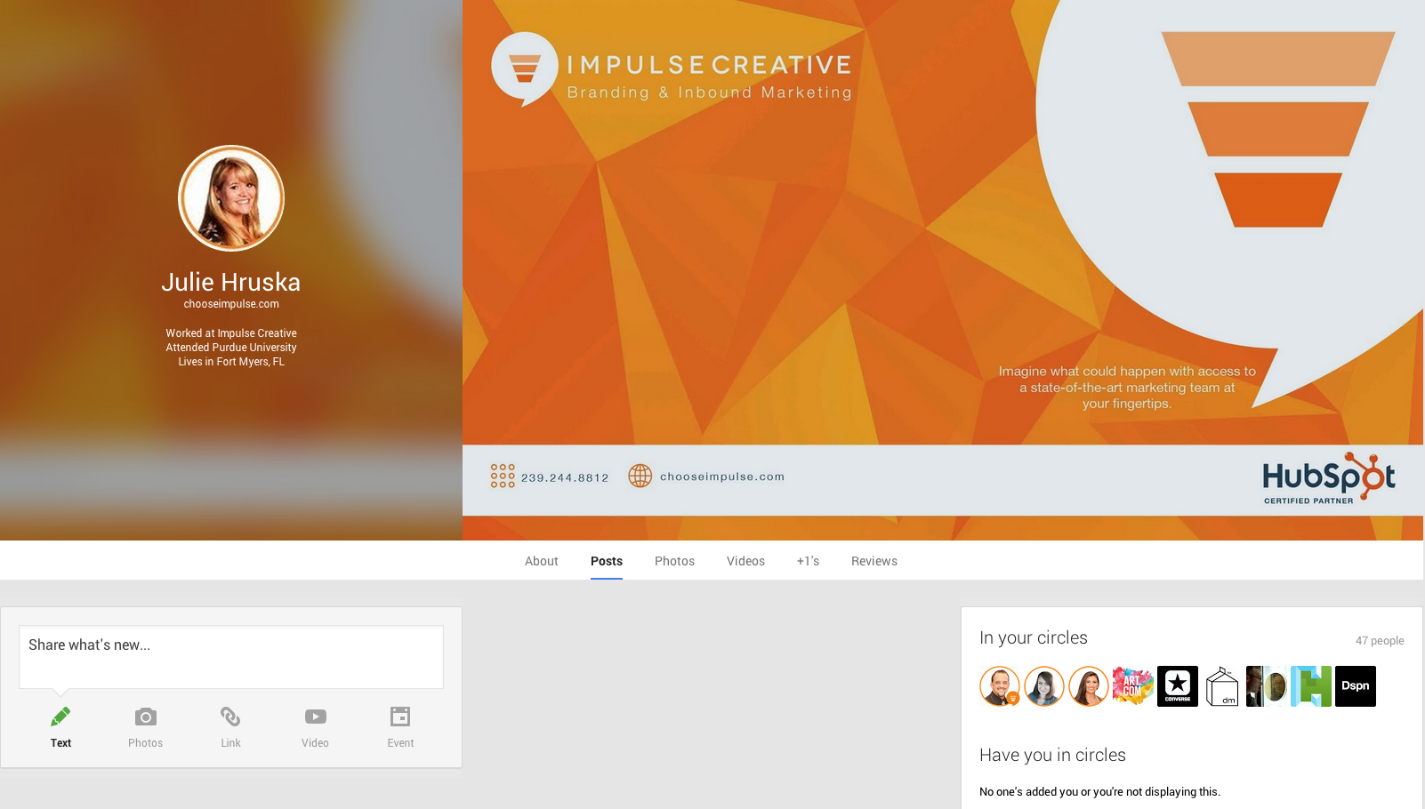
Google has done it again! A new version of the Google+ cover photo layout was released this morning. Your cover photo will now be displayed at full size with a cropped, frosted version of your photo to the left, under your user information.

“Googler Karthik Nagaraj announced the update on Google+ and also explained that the image that has the blurred effect is actually the cover photo that is simply re-purposed next to the main image. The final product makes for a very unique & modern look that also highlights profile/page info much better than the previous options.” - Greg Finn
This new layout also gives you the opportunity to make it really personal! If you're using Google+ to enhance your professional circle then add a little information about your company, phone number, inlcude your logo and more! Who doesn't love using available resources? You always want to have a consistent marketing message and branding across all social media networks.
You can also do the same for your personal account. Maybe include an announcment that you're expecting a new baby, include a count down to your favorite holiday, or just a bunch of Golden Retreiver puppies because they make you smile! It can be anything you want it to be.
The cover photo size is still at a 16x9 portion ratio with the highest possible resolution of 2120px by 1192px. So go update your Google+ profile right now! Have a little fun thinking of cool ways to use it to enhance your brand!
Download our introductory guide to Google+ for Business to unleash that value. Our 34-page ebook includes:
- How to Set Up Your Google+ Page
- 5 Quick Tips for Managing Your Google+ Page
- How Google Search Gets More Personal (& More Powerful)
- Google+ Vocabulary: A Quick Reference Glossary


